Recurly Research
Recurly has an incredible amount of data to explore. Our marketing team was interested in offering our customers and prospects unique insights that could help them benchmark their own businesses in comparison to others.
When you have the access to the data of thousands of subscription businesses and how they operate it’s difficult to determine where to start to pull the threads of an interesting story. Over the past year I've worked on a handful of projects to share aggregate data from thousands of merchants.
Each of these projects was a collabration with brand designers and marketing. My contribution was primarily to the data visualization except for the Credit vs. Debit project in which I also was responsible for the page layout and design.
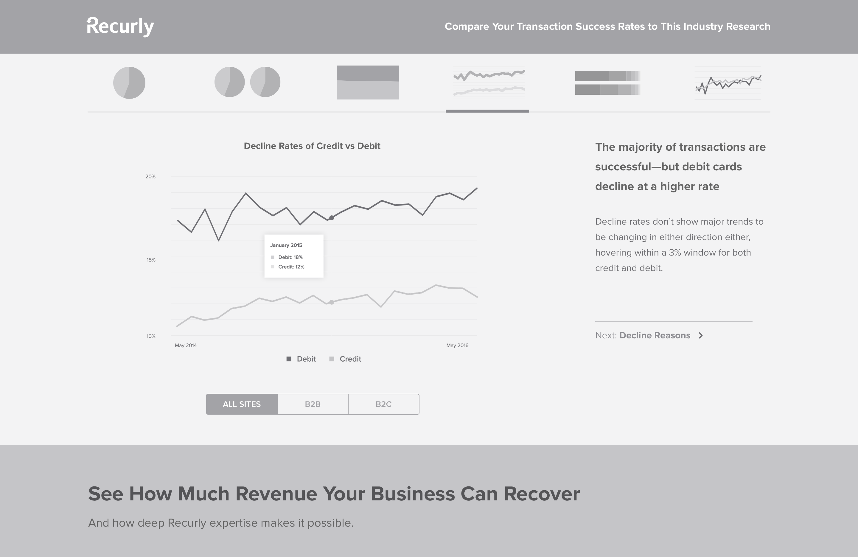
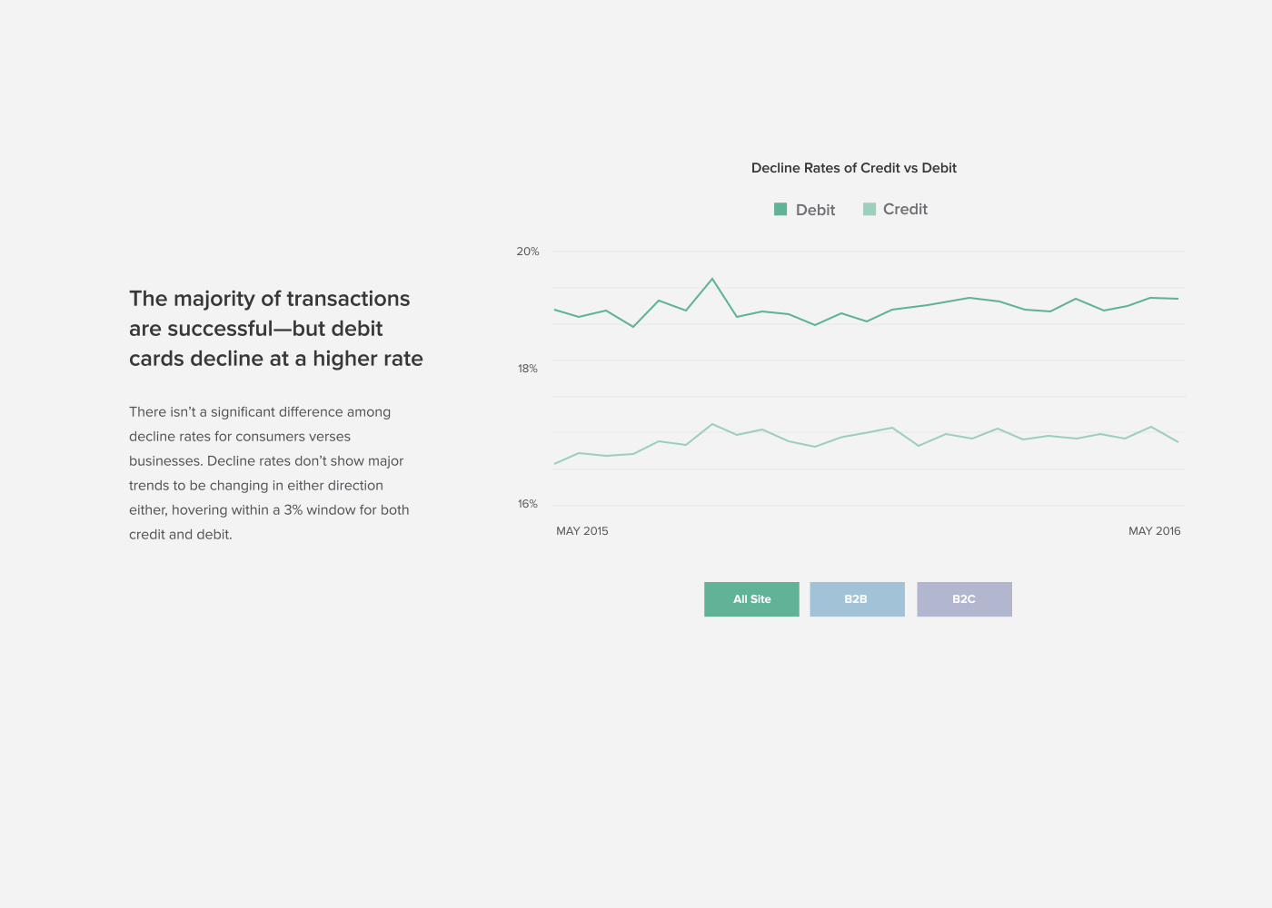
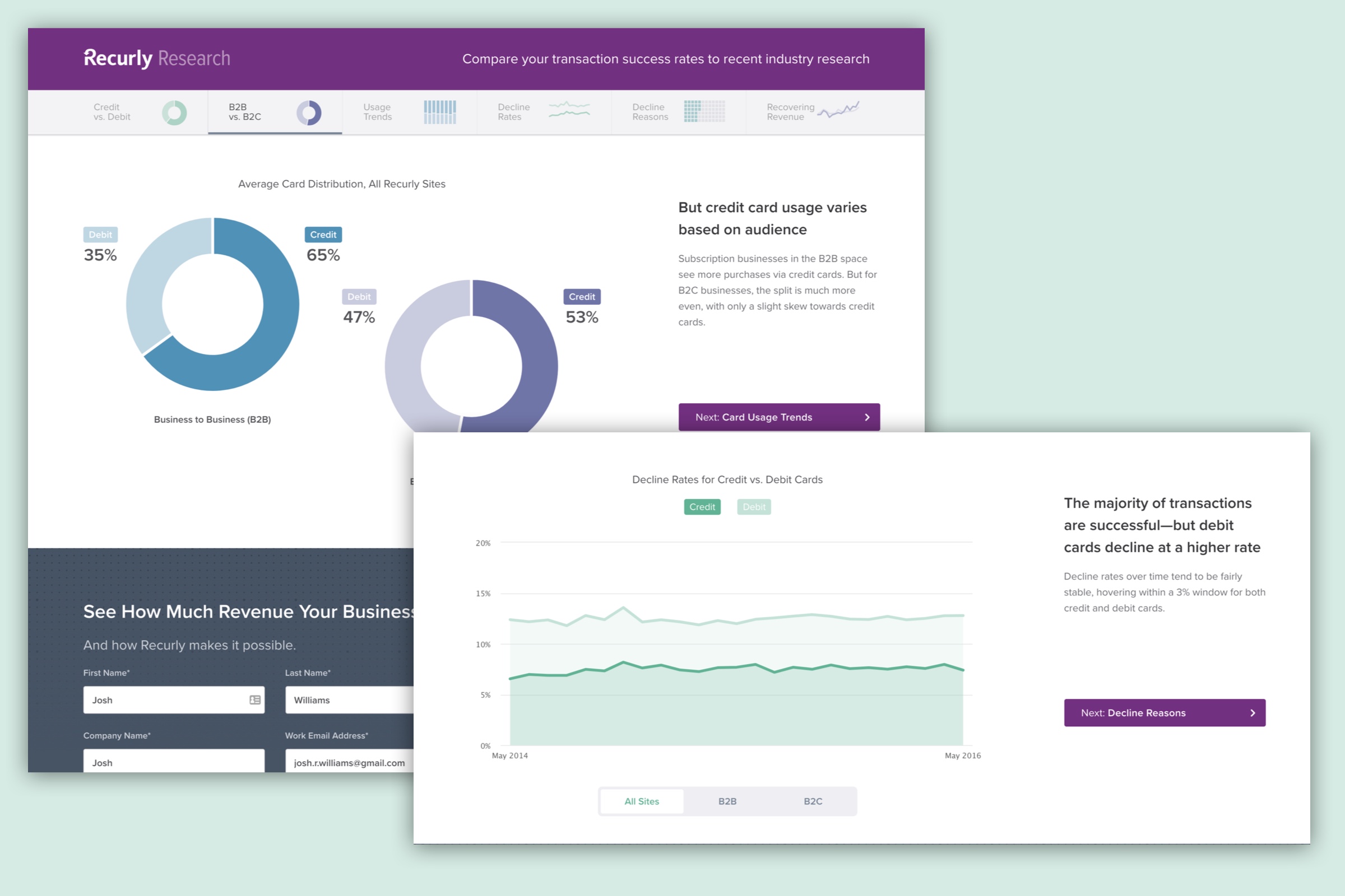
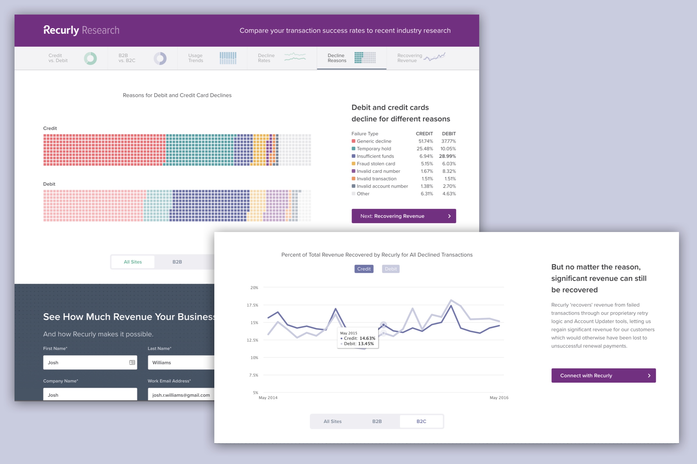
Credit vs. Debit Card Trends
The business analysts provided us with tables upon tables of data to dig through to find both an interesting story but also an interesting way to visualize the data. We quickly realized that the most obvious differences and trends were related more to the style of business that our merchants work with.
The most obvious way to slice the data initially was to cut our merchants into two basic catergories: B2B and B2C. B2B merchants tended to see more credit card use while B2C was found more debit card usage and often higher decline rates.
Early wireframes sketched out a potential layout including rough navigation, tooltips, chart filters, and commentary.
Collaborating with Brand Design
Knowing that these pages would live on our marketing site meant that they would have to be in the same style as the rest of Recurly’s marketing collateral. Collaborating with the Brand Design team at Recurly meant working with a new style guide and a different aesthetic than my usual product design work.
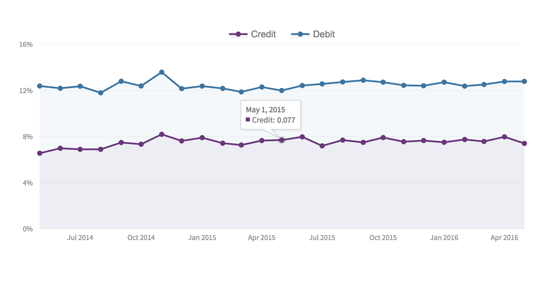
It took some convince to get marketing onboard with the idea of implementing a charting library that would support chart transitions and tooltips so that viewers could really know exactly what each rise and fall in the chart actually meant in the data.
Initially marketing wasn’t on board with the idea of an interactive research piece. Animated prototypes helped to sell the idea and build excitement.
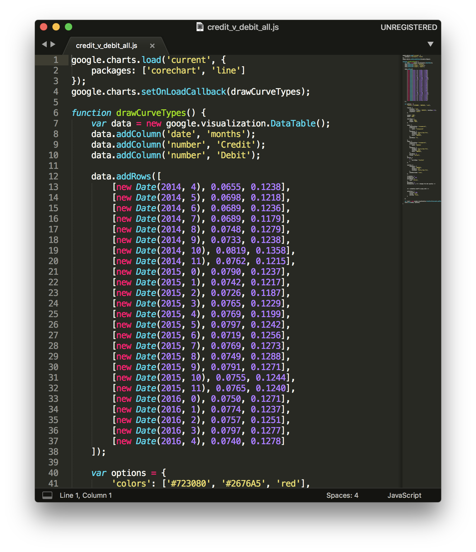
Dataviz Prototyping
It was relatively straightforward to prototype each of these data points using Excel. I also experimented with Tableau to build different visualizations to see if there was a more creative way to present the data. Ultimately simple bar charts, box and whisker diagrams, and line charts won over sankey diagrams or more "creative" visualizations that were hard to understand.
Using Codepen, Google Charts, and Highcharts to prototype visualizations, transitions, and tooltip hoverstates helped to bring the project to life and ultimately was what sold the marketing team on the concept of interactive landing pages.
Navigation Prototype


Design & Build
For Recurly Research projects I was responsible for the dataviz and chart styles. This meant partnering closely with the brand design team who owns the overall layout, typography, and overall look and feel. The cross disciplinary approach leads to an exploration of styles for each project, while not being limited by individual creativity.
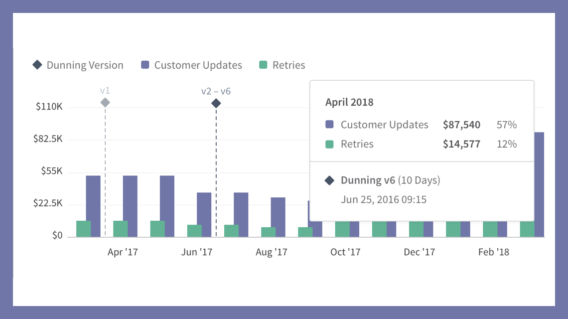
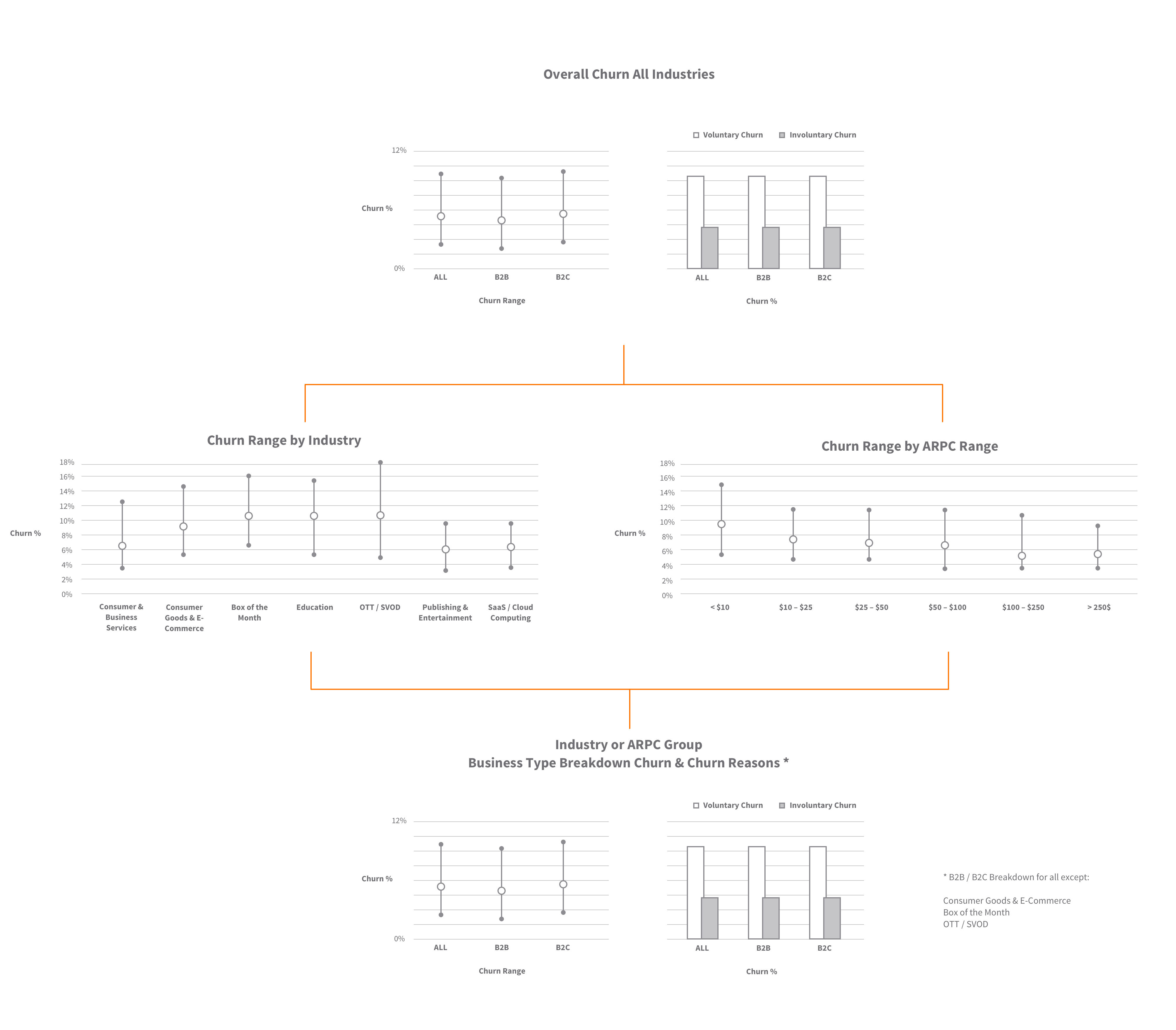
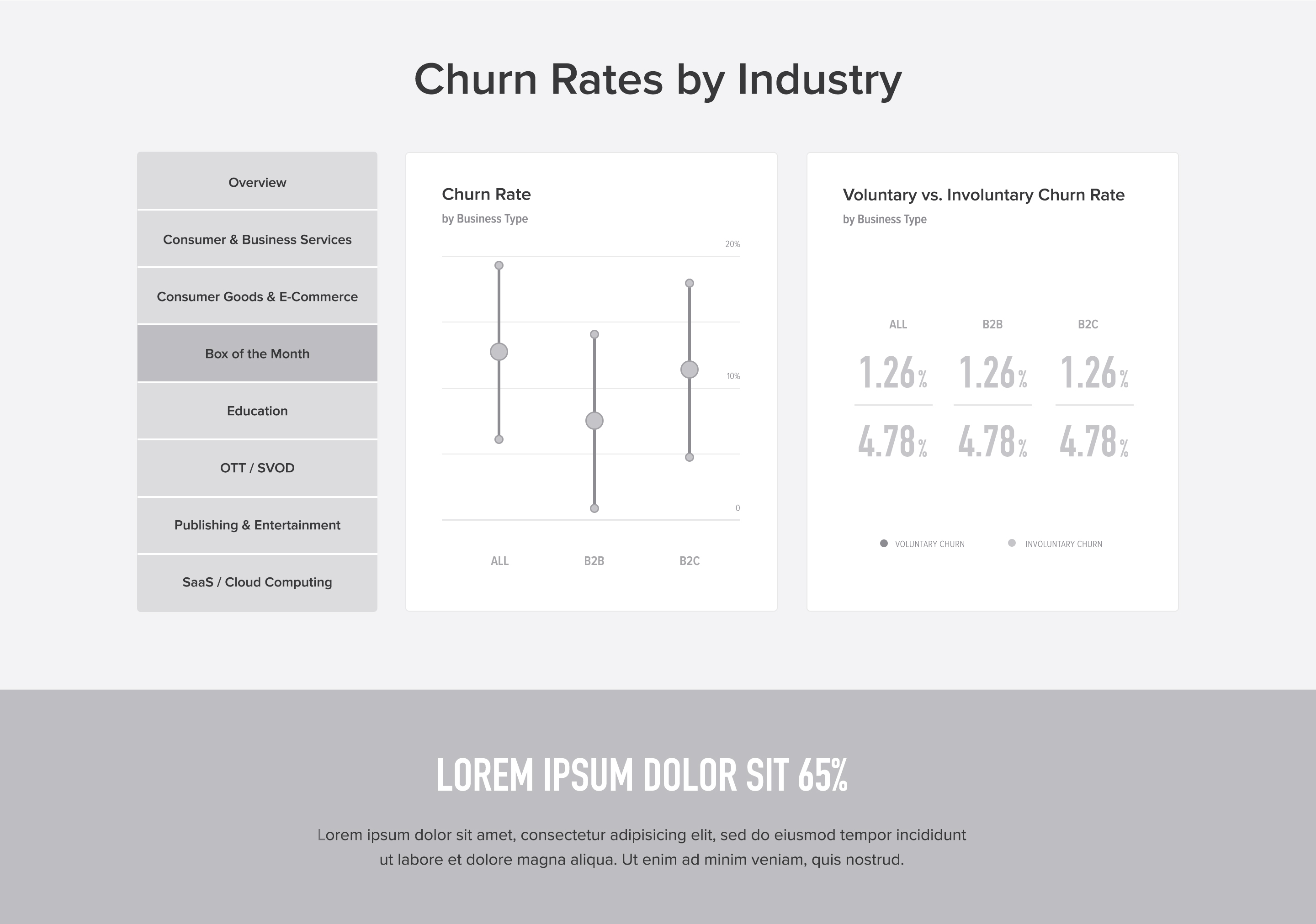
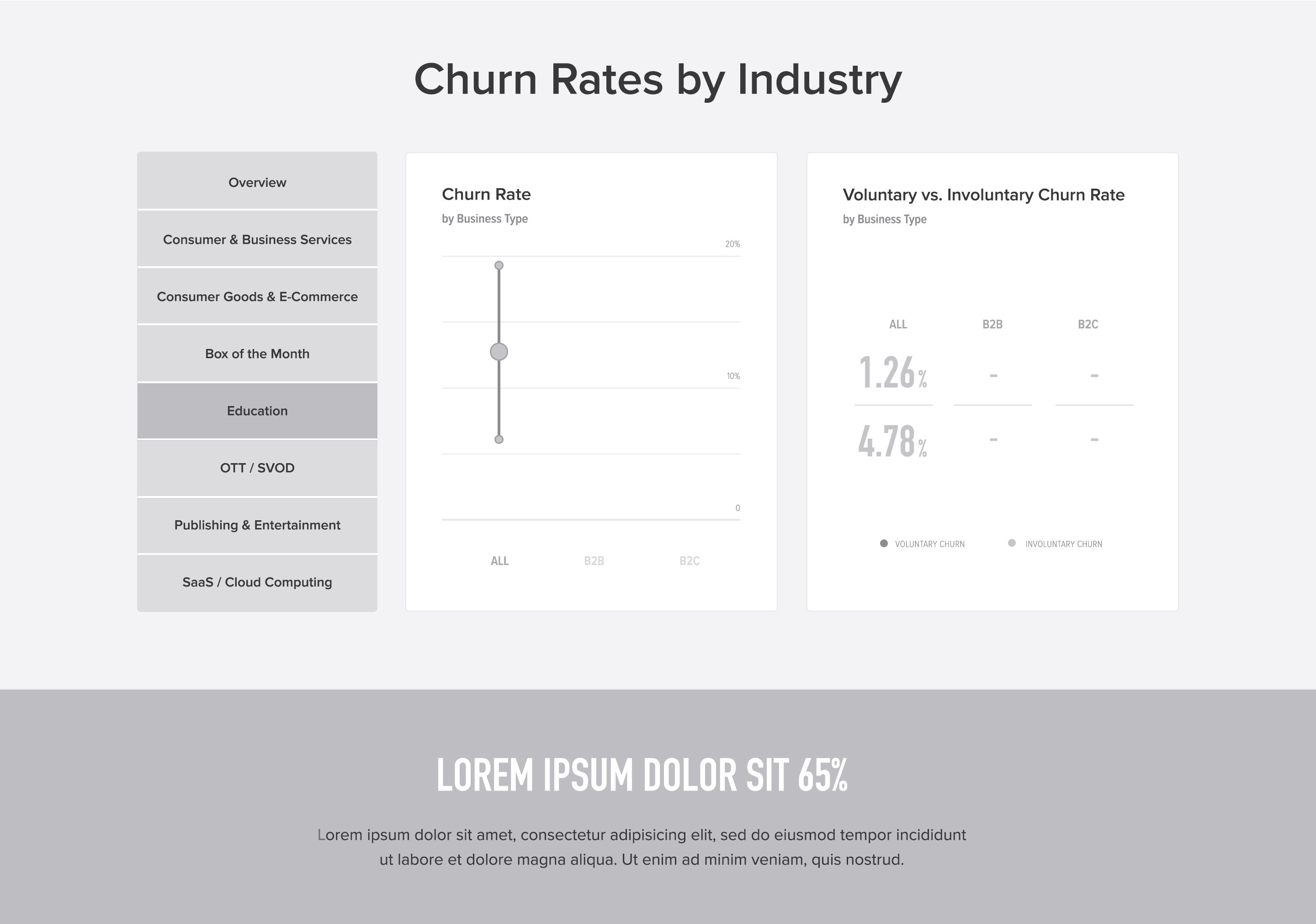
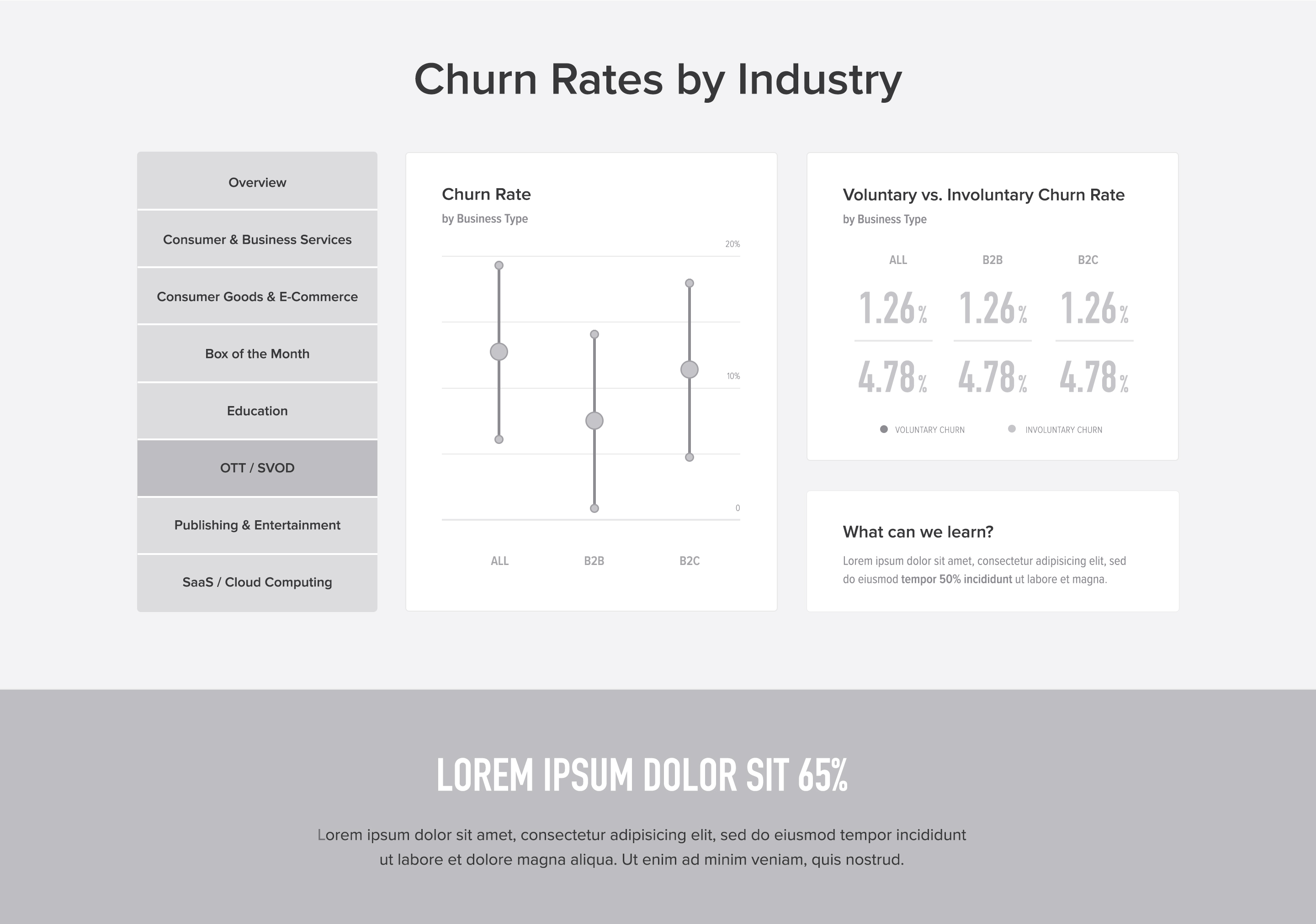
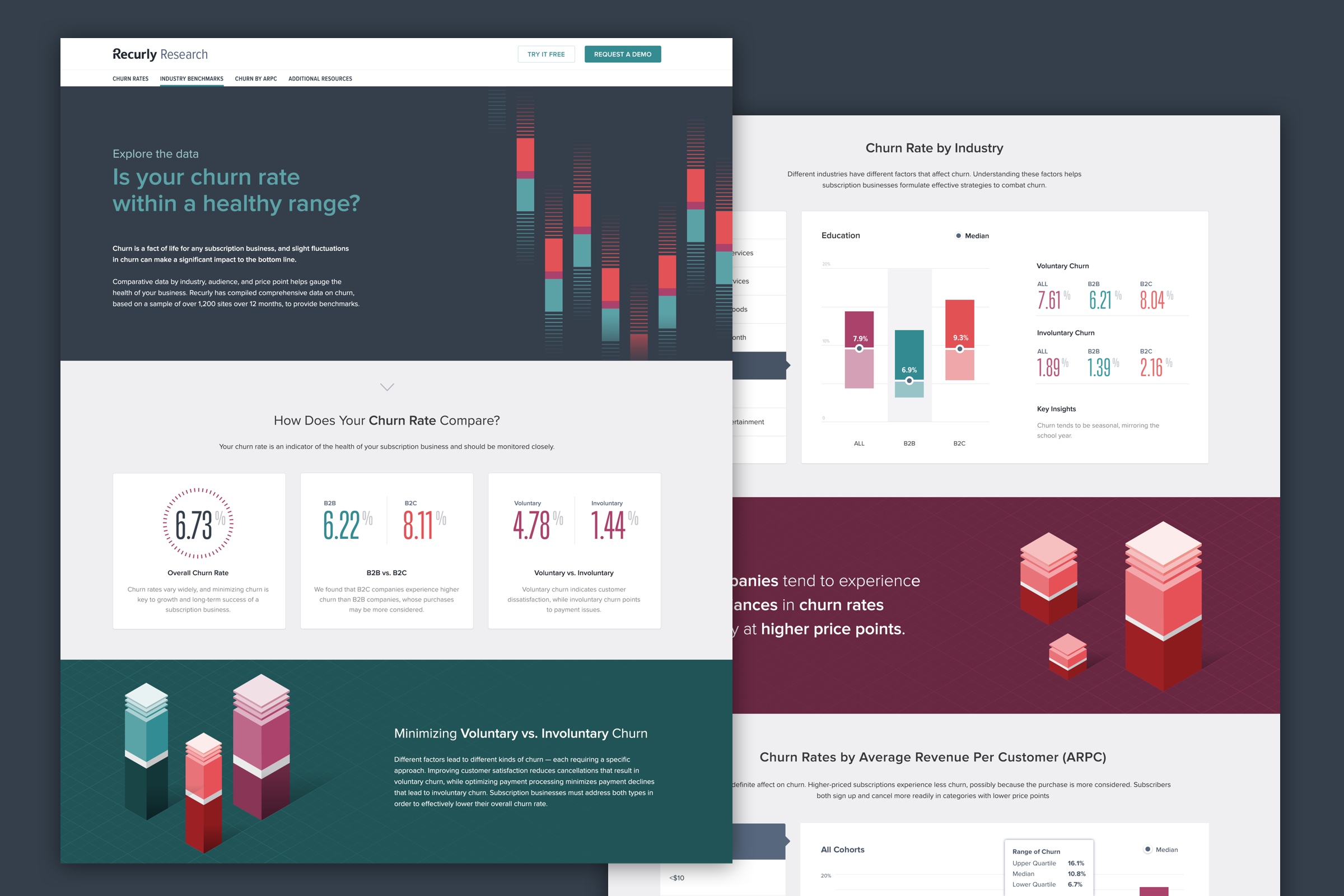
Churn Analysis
info.recurly.com/research/churn-rate-benchmarks
Page design and illustrations by Carrie Voldengen
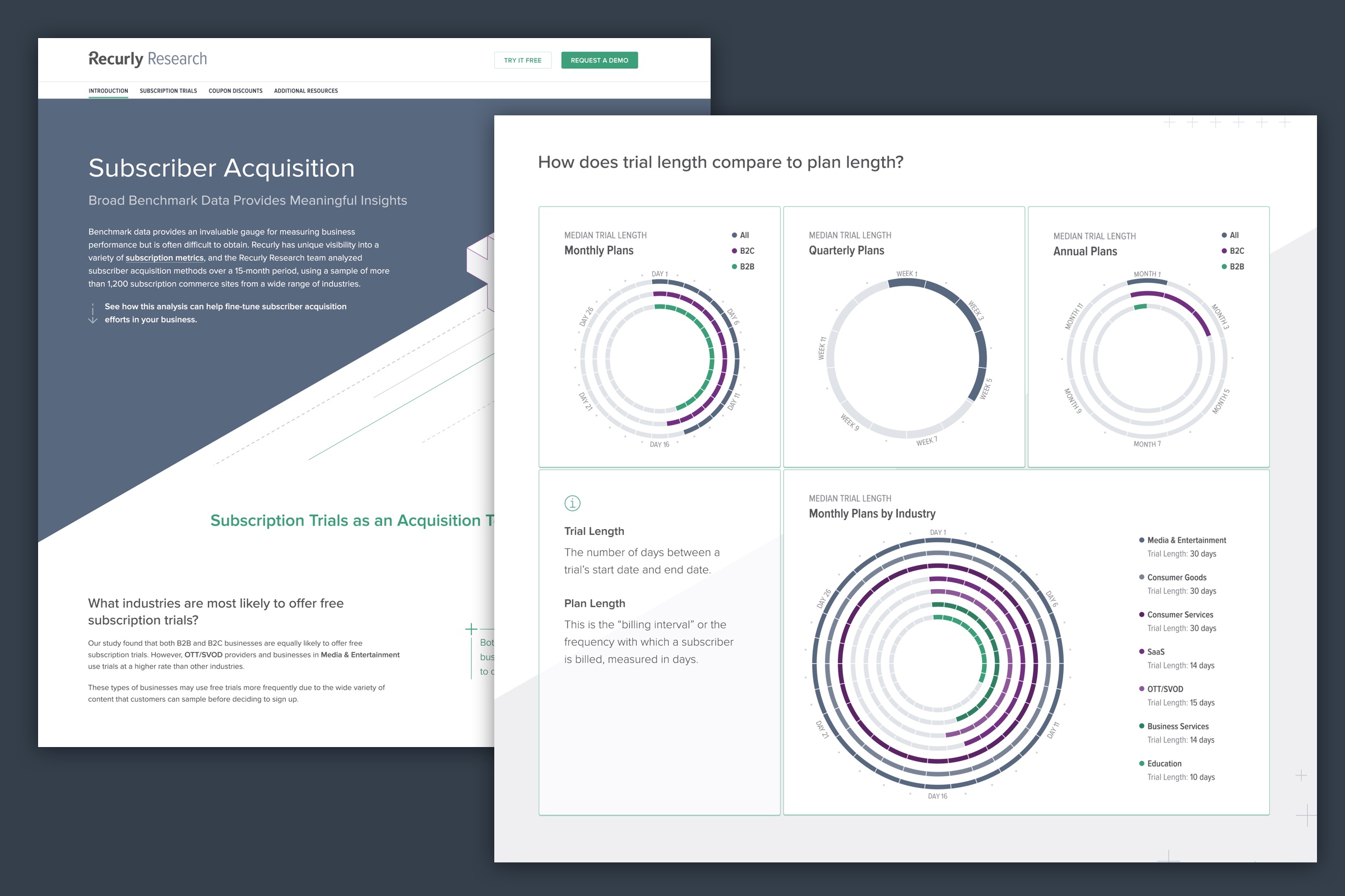
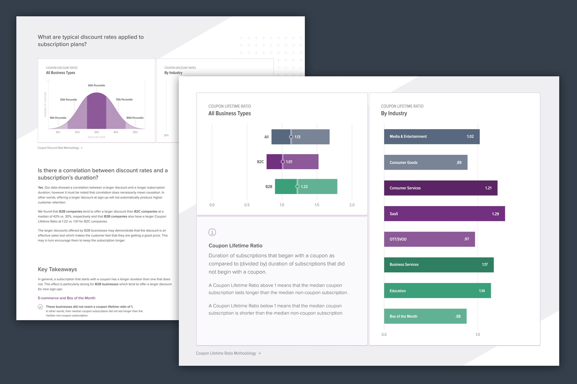
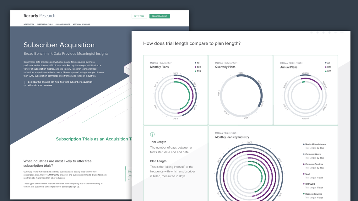
Subscriber Acquisition
info.recurly.com/research/subscriber-acquisition-benchmarks
Page design and illustrations by Darby Nelson