Recurly Analytics
Reinventing Recurly's Analytics Tools
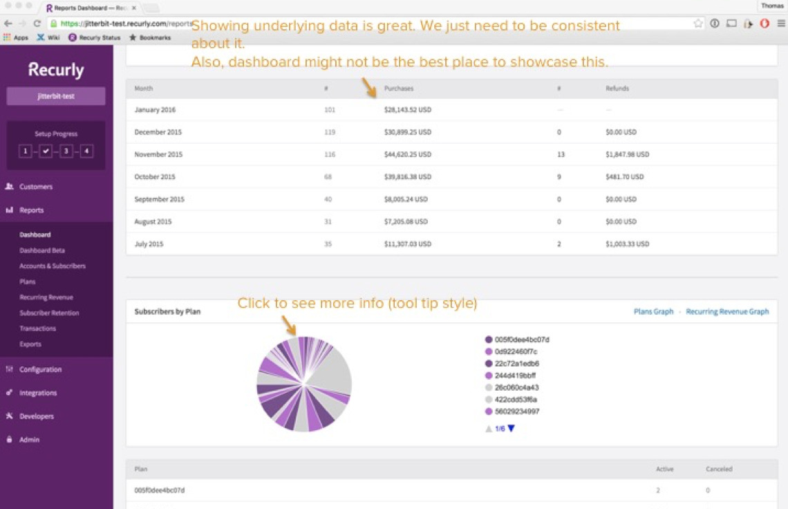
Recurly’s legacy reports feature was a relatively barebones approach to data visualization that was long overdue for an update. The amount of data behind Recurly customer’s businesses meant that getting visualization was slow to process and load, or for many VIPs would never even load at all.
What our customers wanted
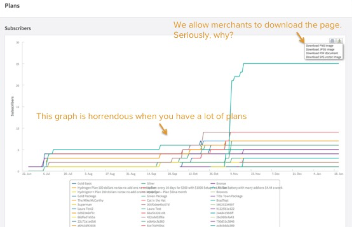
Customers complained that the calculations in Recurly Reports were inaccurate and that the charts were impossible to read. This was paired with an ineffecient data structure that meant for many merchants their reports would never load, and when they did they couldn’t trust that the information was accurate.
Initial Research
There were countless feature requests and complaints to sort through when trying to get to the bottom of the problem. Our customers appreciated having data visualztion and reports in the app, but didn’t trust the numbers and felt like they couldn’t really gain any insights from what was presented to them.
There were a handful of other companies, some competitors and some business partners that helped inspire our team to build a better analytics offering. Baremetrics and Chartmogul already supported Recurly’s API to feed data into their offerings. Having an idea of what was already possible helped to steer us in the right direction.
Project Scope
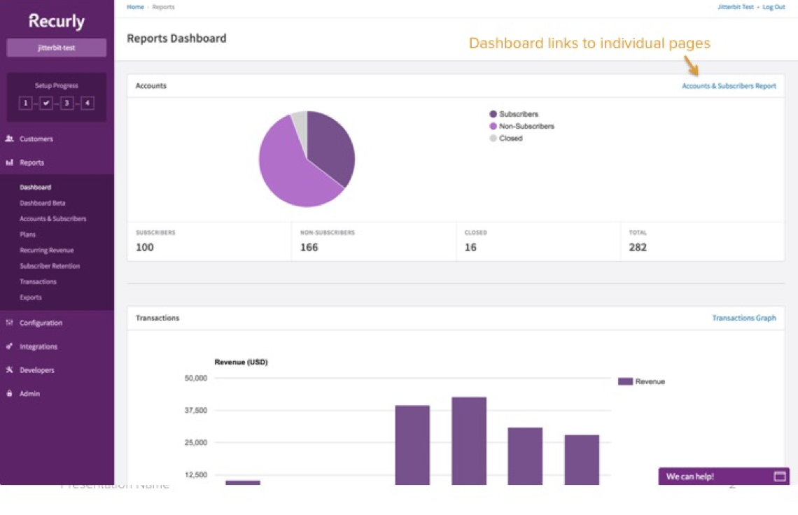
One of the challenges of this project was knowing that our plan was to replace the legacy reports entirely without removing any of the functionality along the way. We had to ensure that our new offering would have a comparable and improved version of the old report.
The other challenge was knowing that with our new reports came new calculations and key metrics for customers would ultimately change. We knew going into this that we would introduce confusion and potentially a lack of trust from our customers.
We would have to carefully communicate the changes, why they were better, and how we ultimately came to make decisions that woud have a major impact on key business metrics that our customers rely on. When a merchant sees their MRR change—they notice and want to know why.
Early Wireframes
This project was my crash course intro data visualization for an enterprise level merchants. Our goal was to initially release a new version of every existing report which meant designing a system that could support a variety of visualiation and a variety of datasets.
It also needed to be flexible enough to adapt to the kinds of data being presened. Certain calculations would require groups of information like stacked column charts, while others were more appropriate in a simple table.
Higher Fidelity
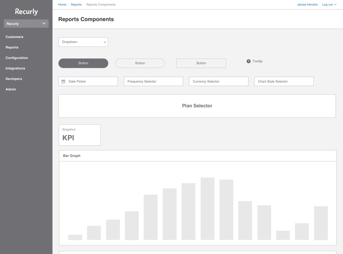
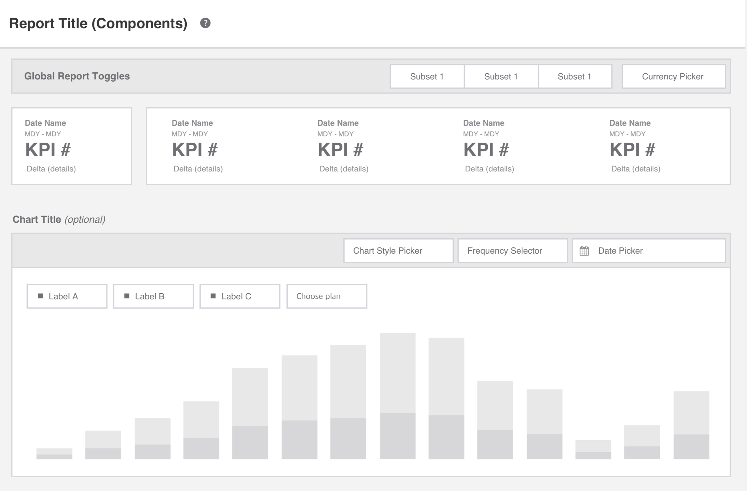
Design went in stages as I worked on what would become the building blocks of our analytics platform. Utilizing rudimentary wireframes I was able to build a systematic layout consisting of the general page template, date pickers, currency pickers, generic charts, and tables. This helped me develop the structure of each report while our business analysts and data engineers worked through the calculations that would make everything function.
Systemizing Analytics Components
An analytics tool with beautiful charts and tables is nothing if you can’t interact with what you’re viewing. Our component library was built to support to presentation of relatively static information with simple filters and page controls. Analytics required a number of new components to facilitate the zooming in and out of information.
Key Performance Indicators
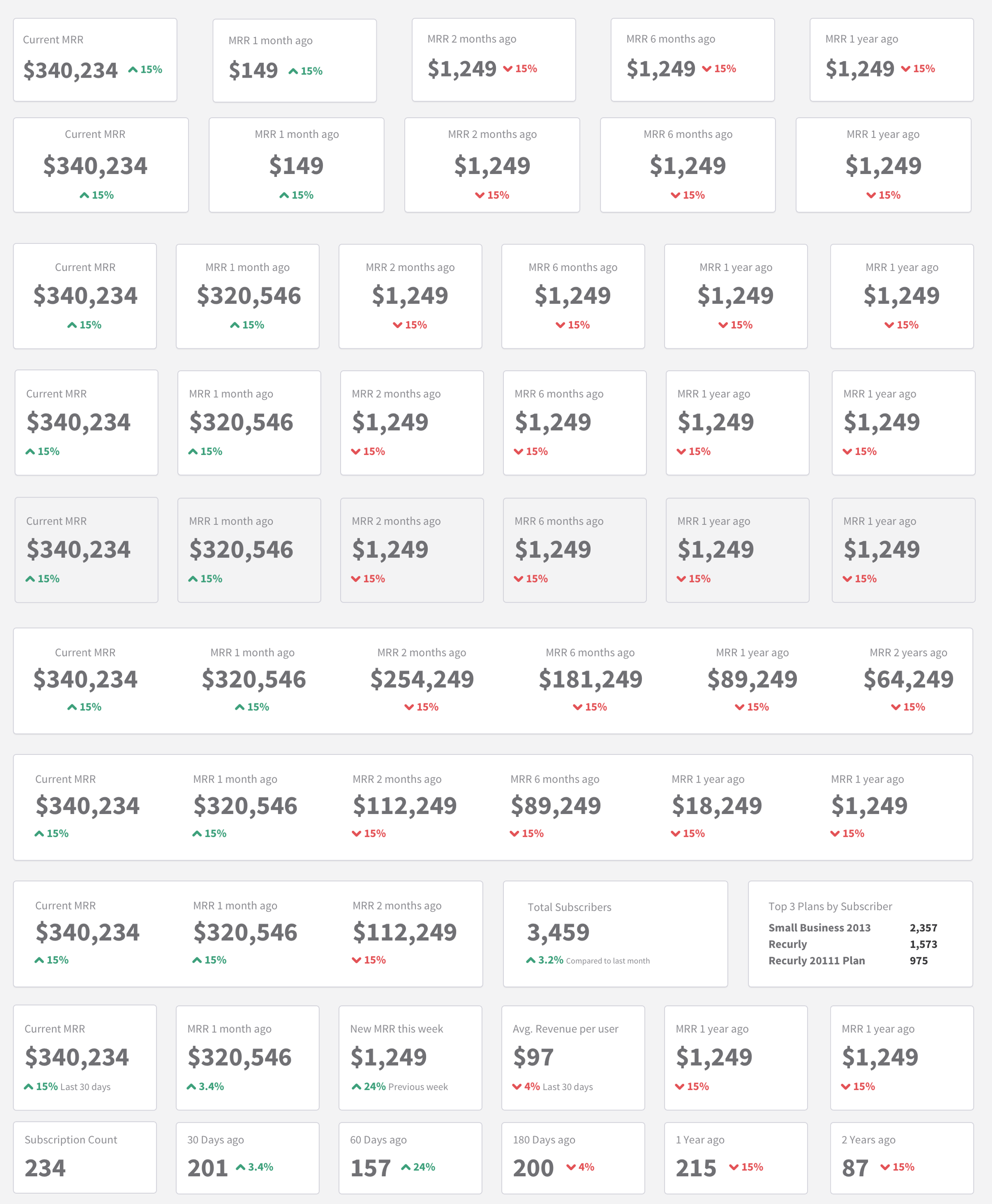
One of the most common patterns is comparing key metrics at a specific date to a previous date. Determining the most intuititve method for showing a comparison proved to be a unique challenge. I tried dozens of options before ultimately settling on a design solution with a tooltip to expliciity label what is being compared to what.
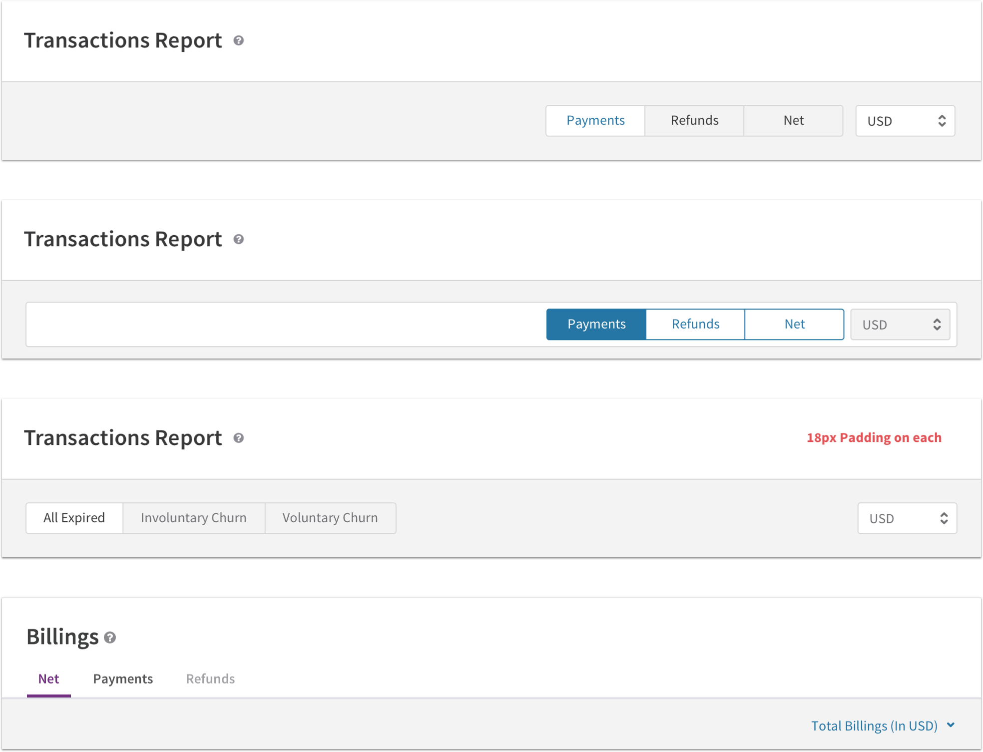
Report Tabs & Page Controls
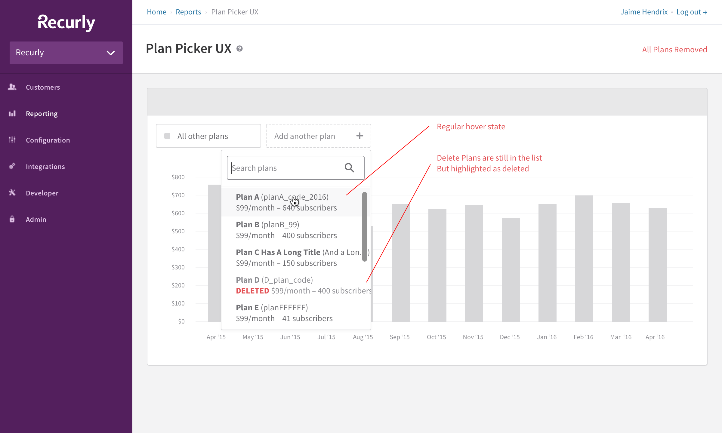
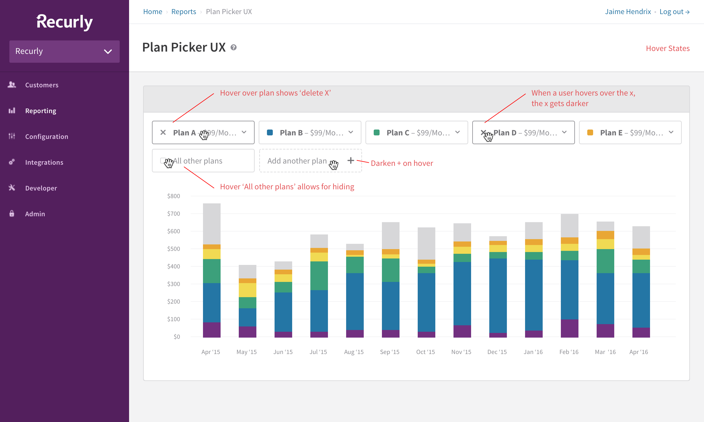
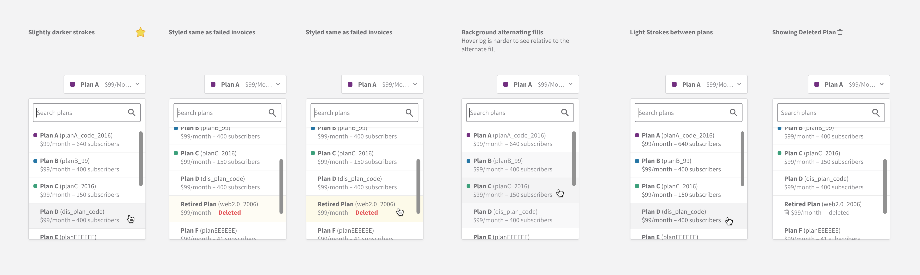
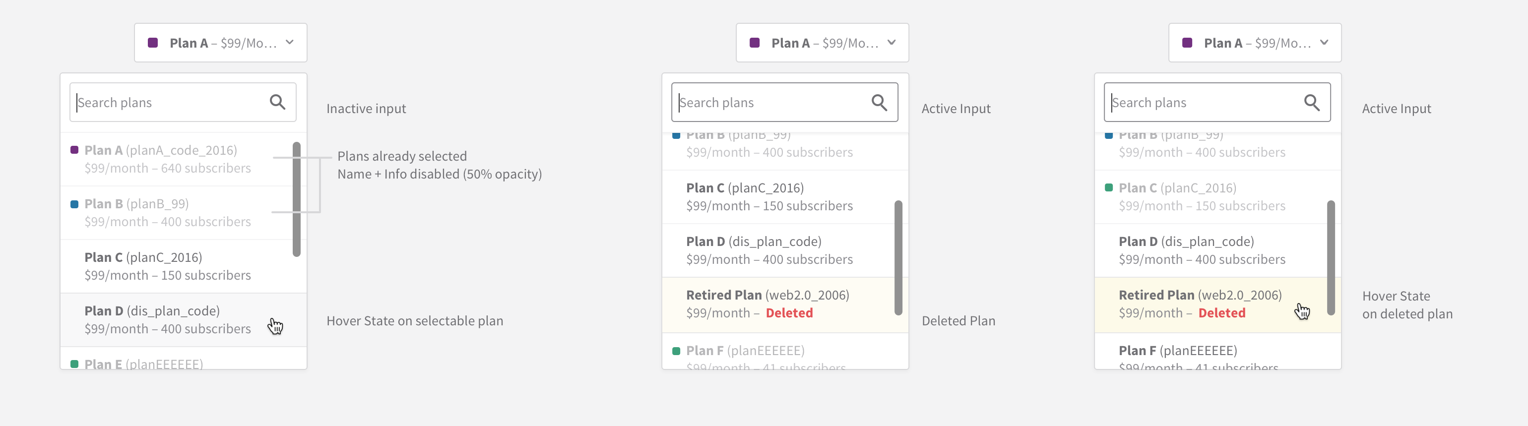
Plan Picker
On certain reports we're able to give users the ability to filter by specific plans. In some cases the plan picker could select multiple plans while in others it was simple one plan at a time. The plan picker component needed to be flexible enough to work in either scenario.
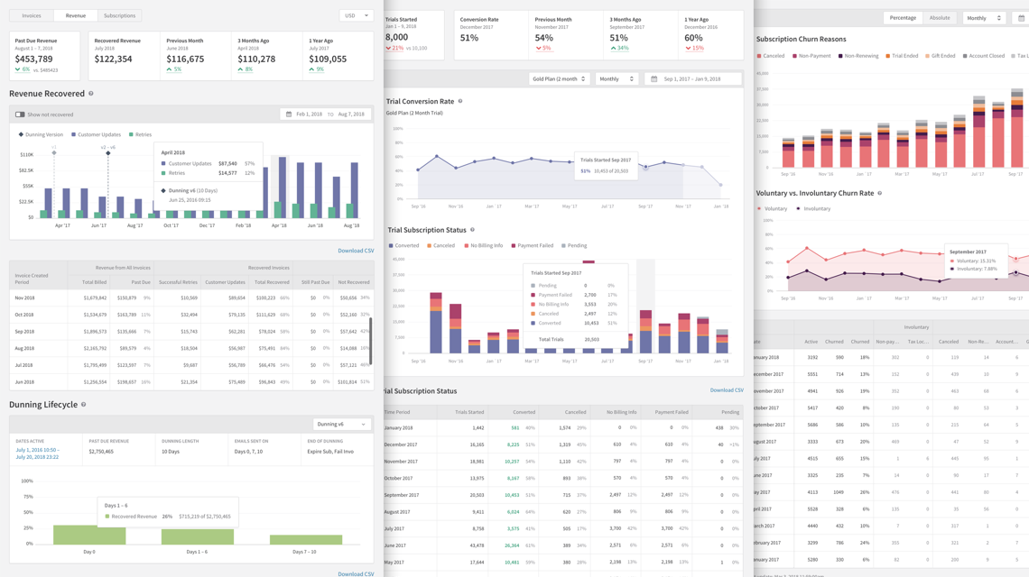
Final Reports
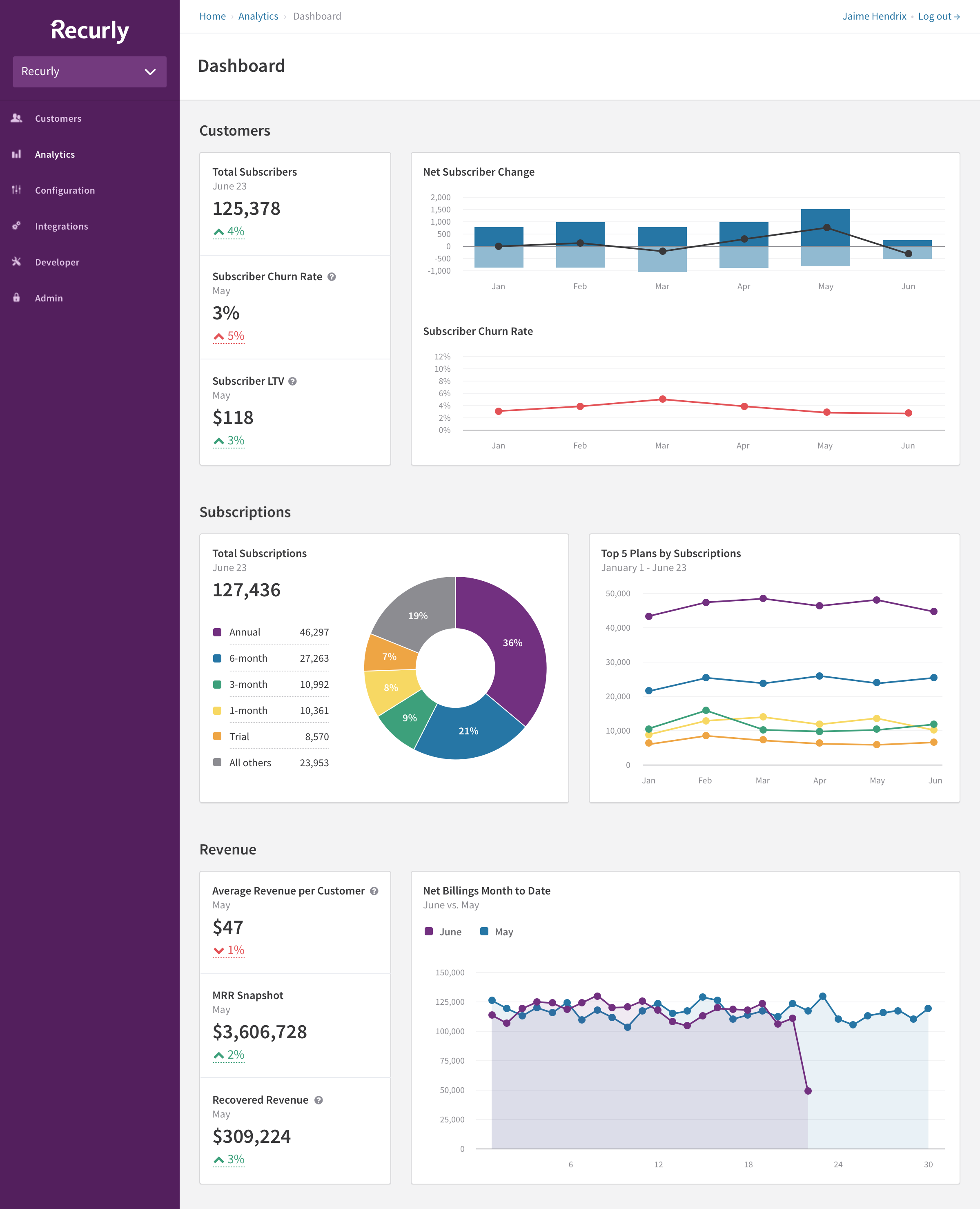
Dashboard
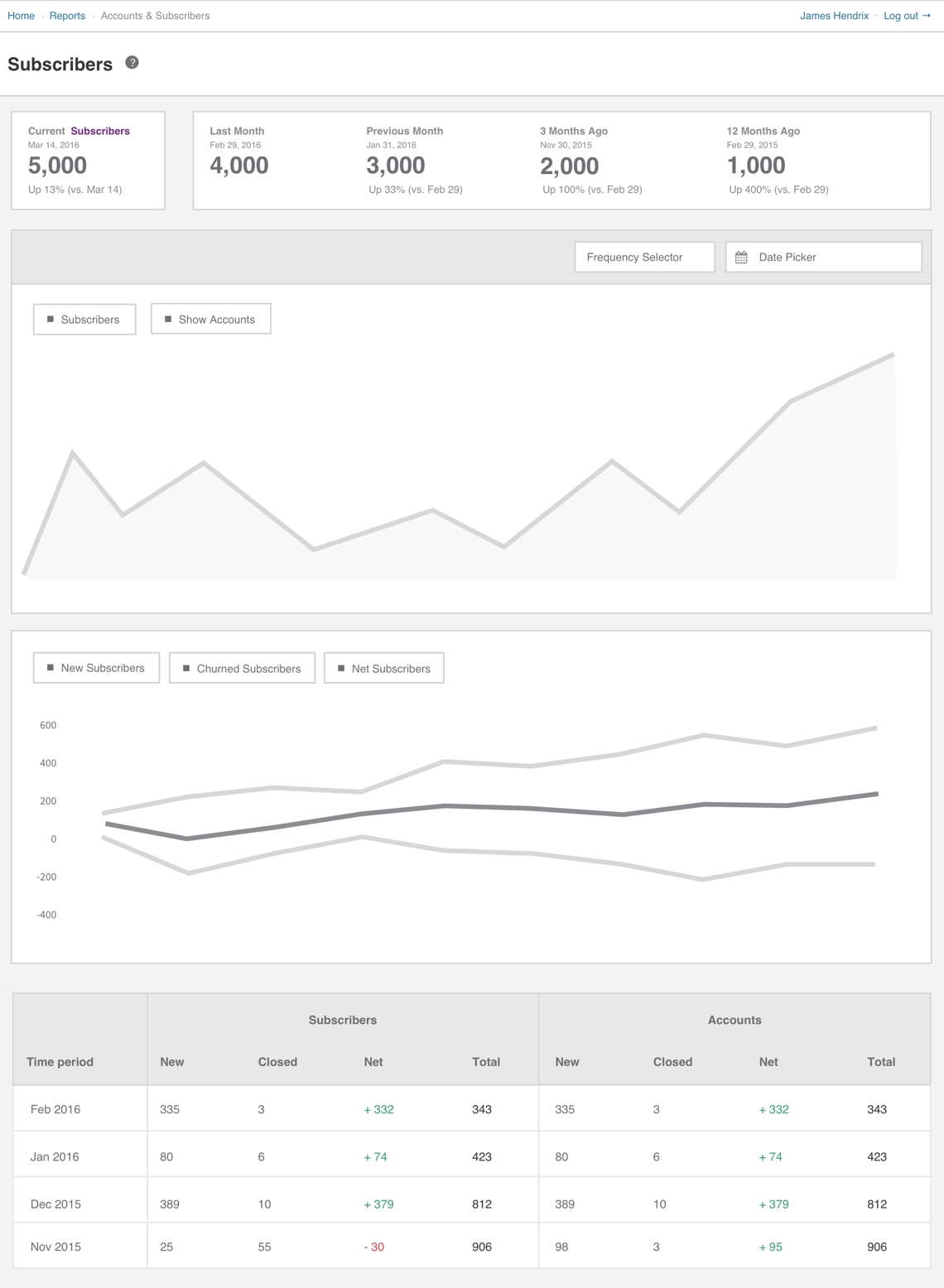
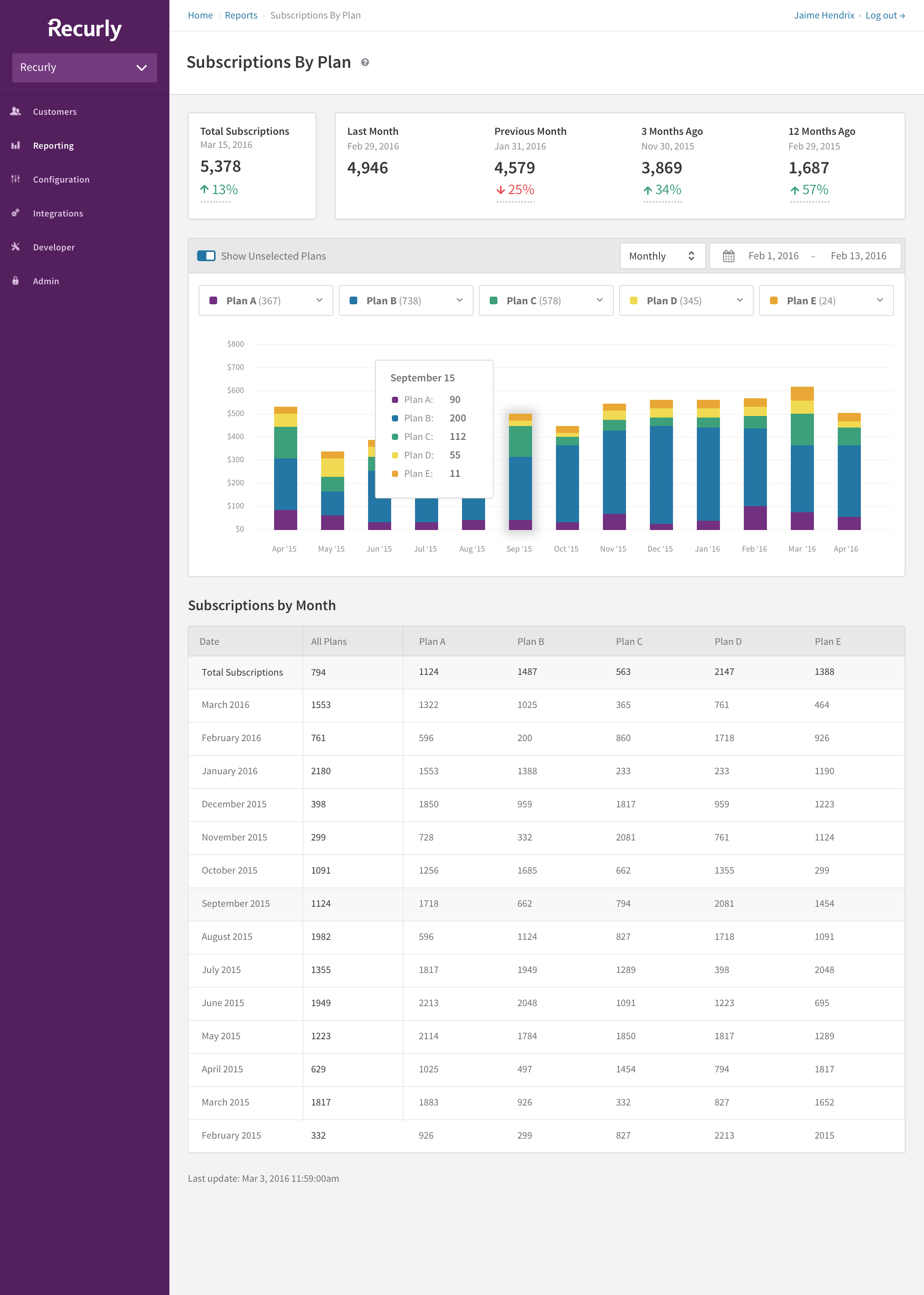
Subscriptions by Plan
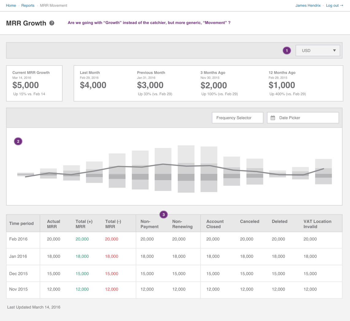
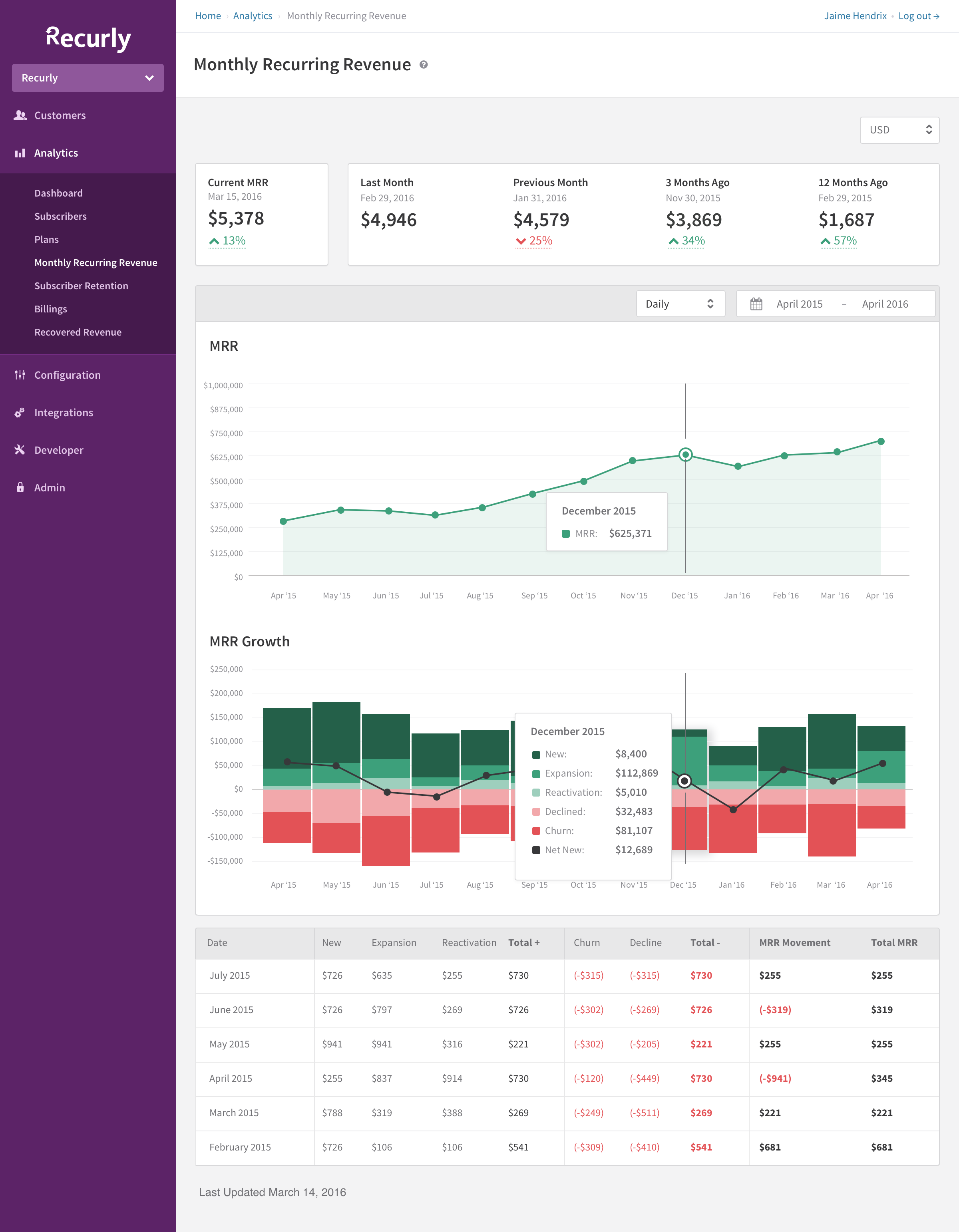
Monthly Recurring Revenue
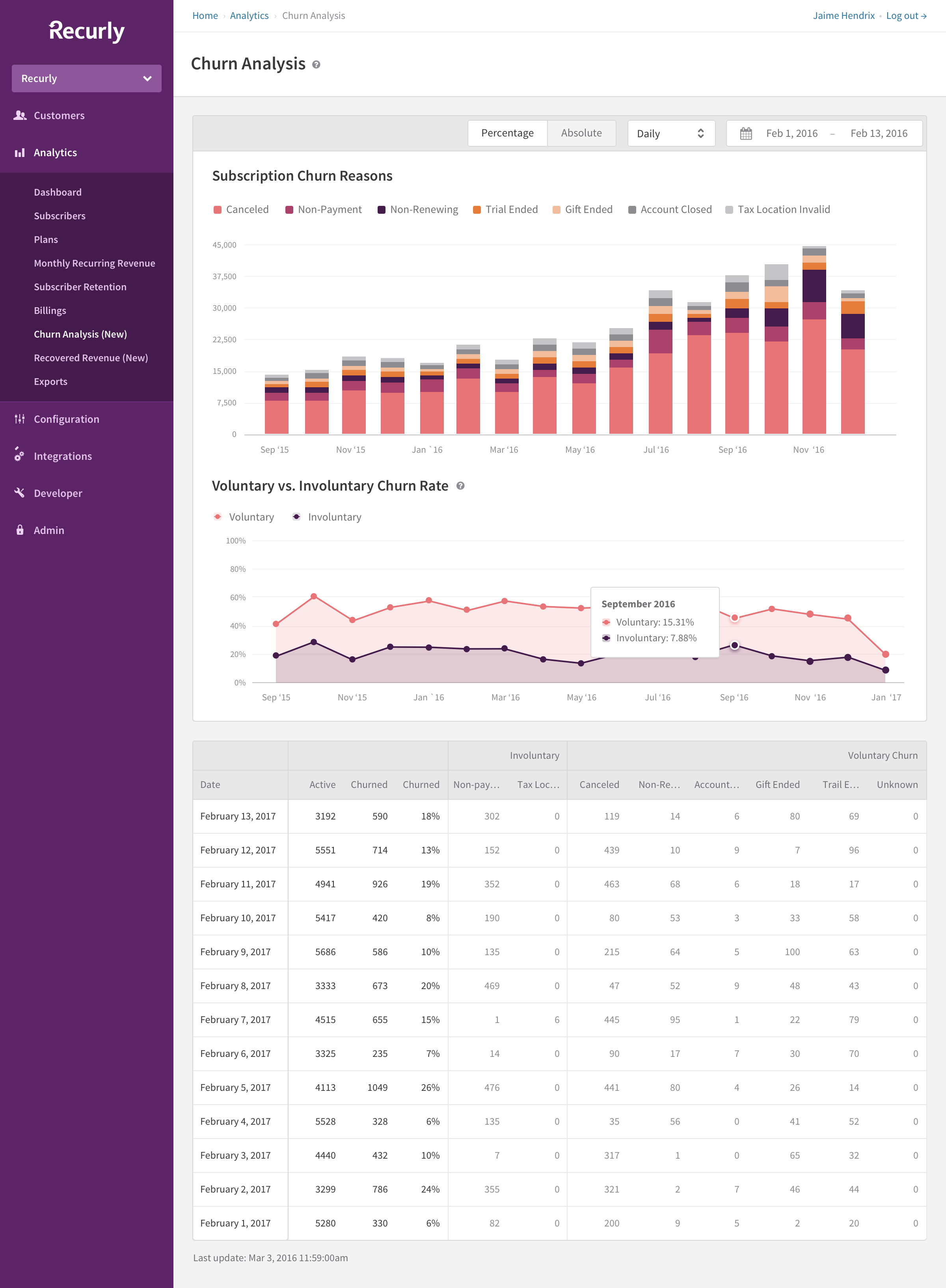
Churn Analysis
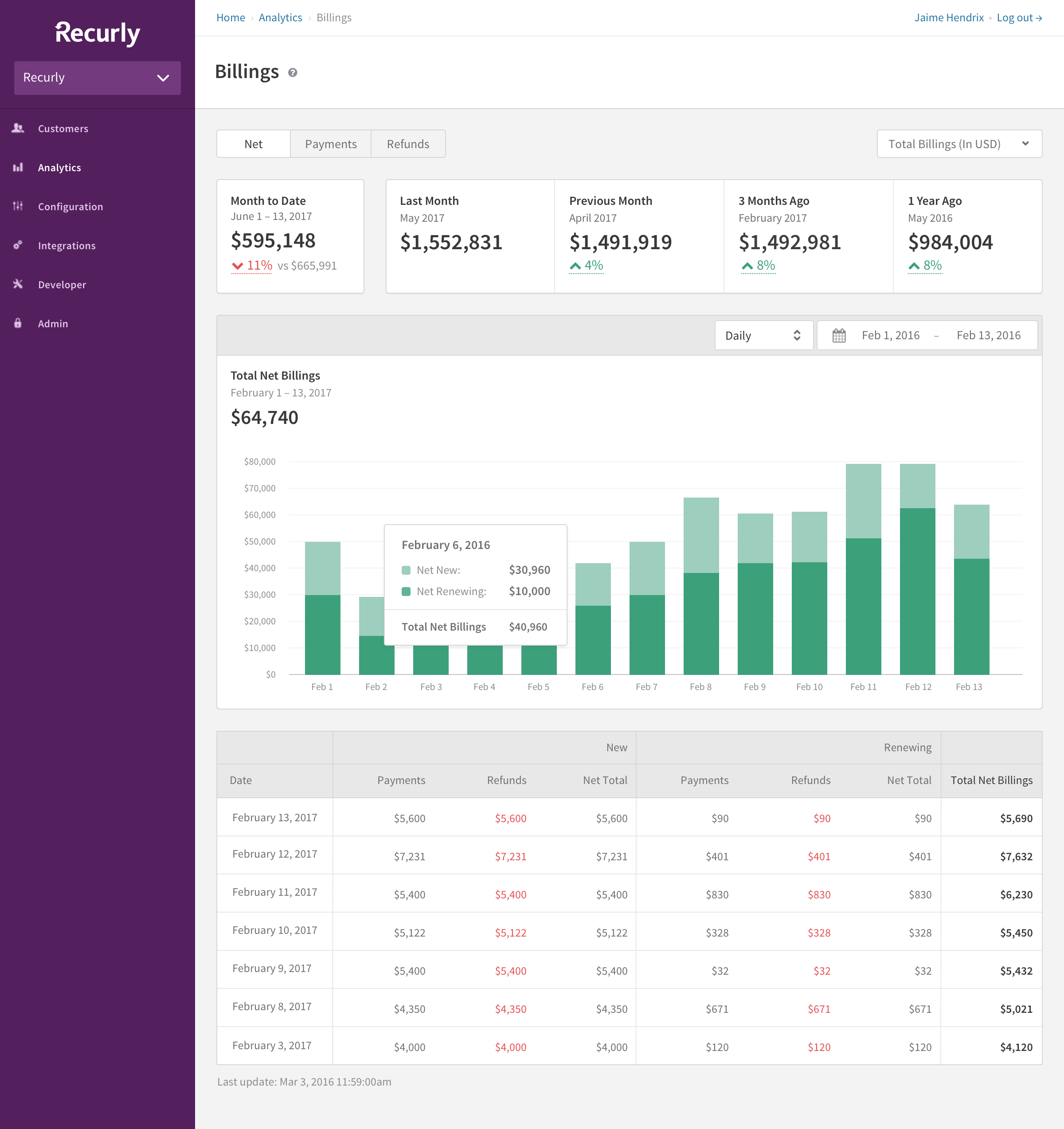
Billings
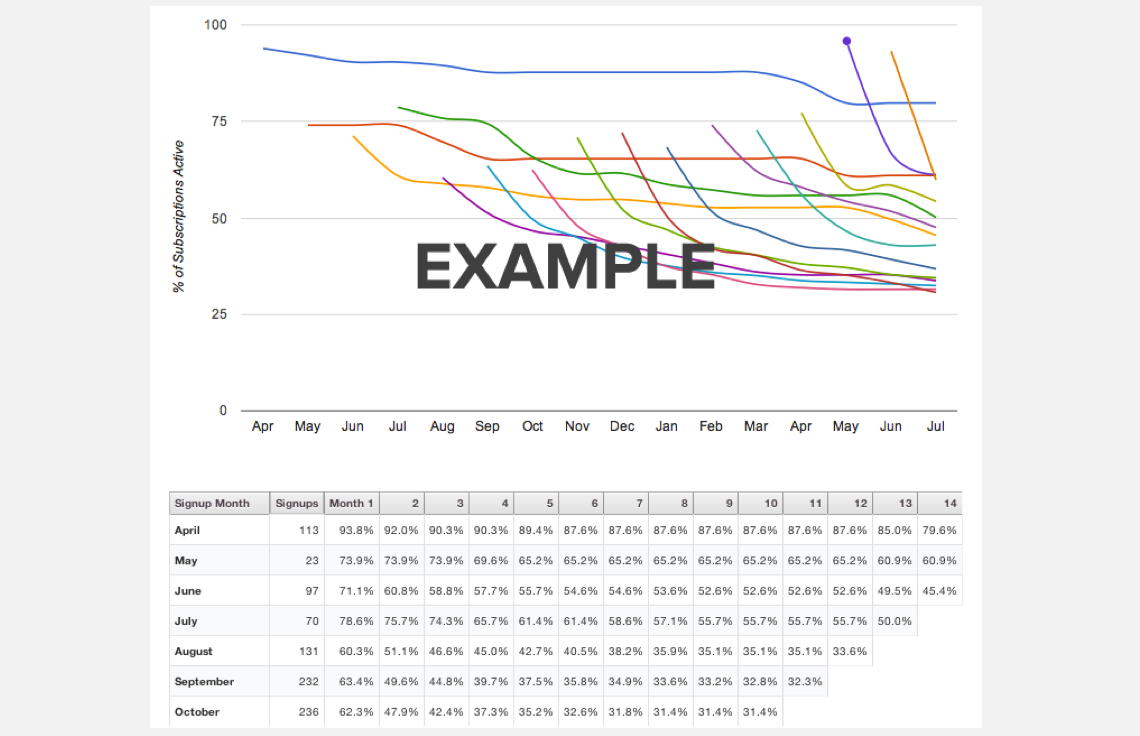
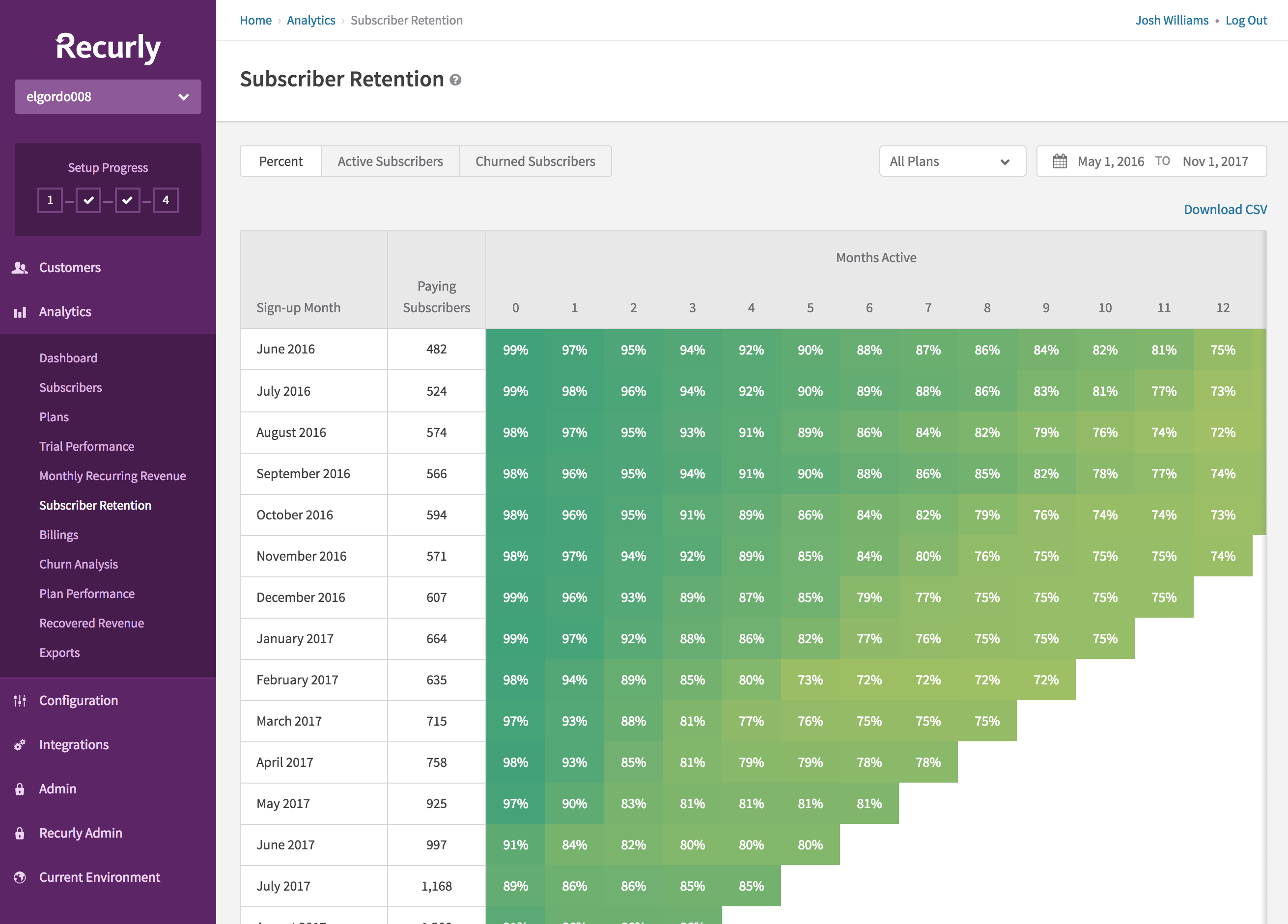
Subscriber Retention
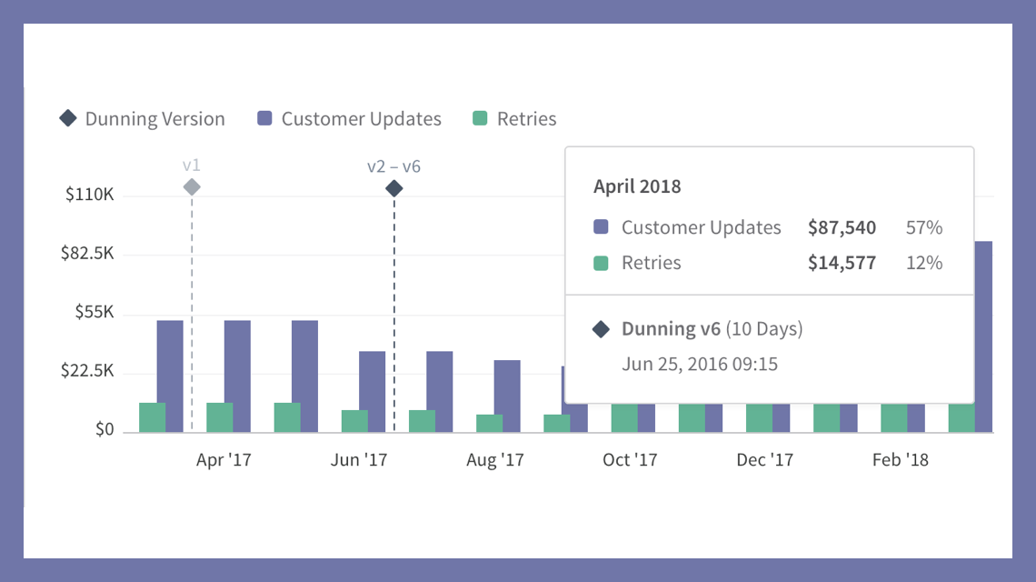
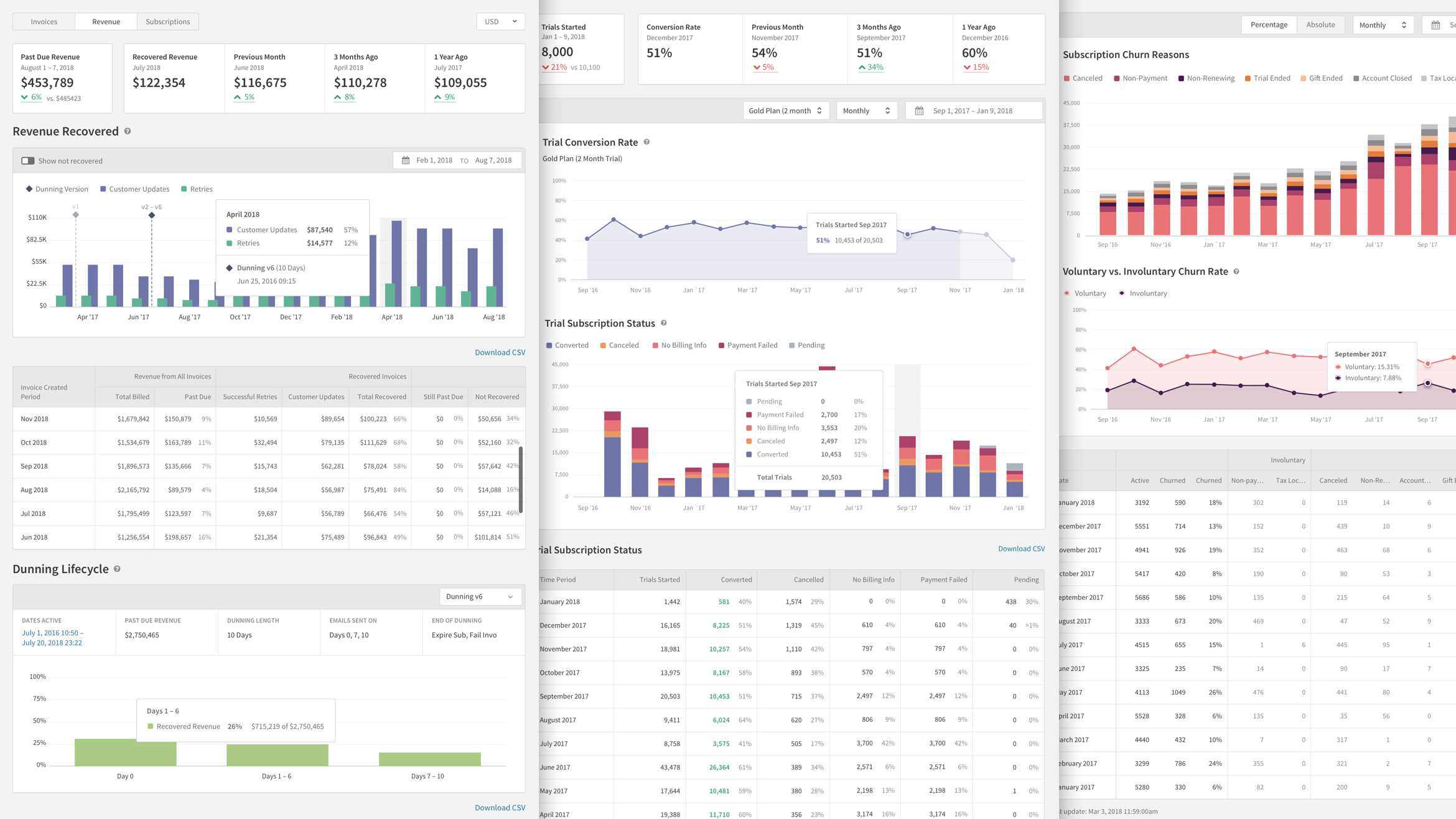
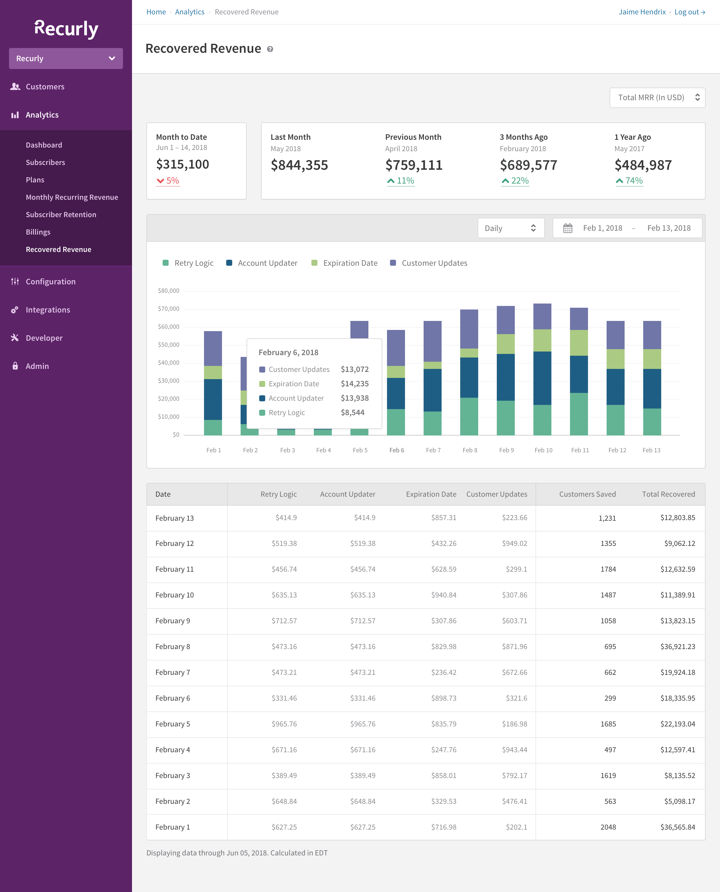
Recovered Revenue
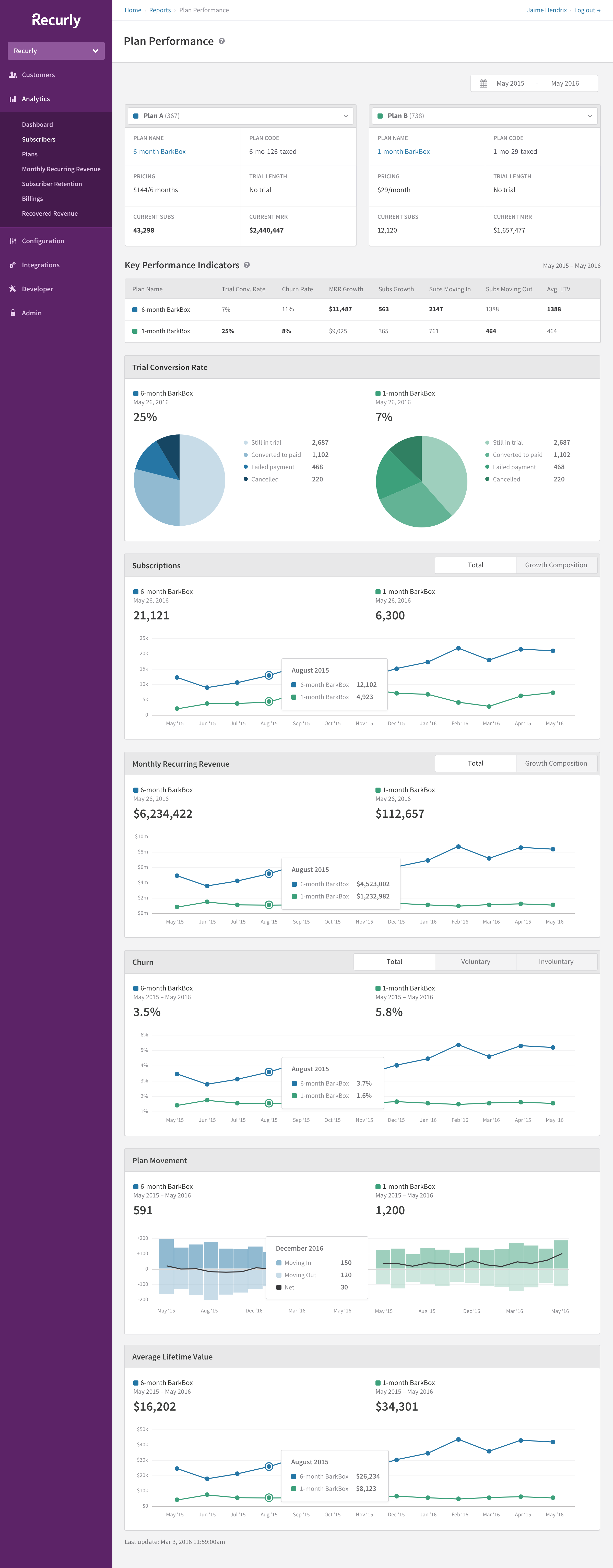
Plan vs Plan Performance
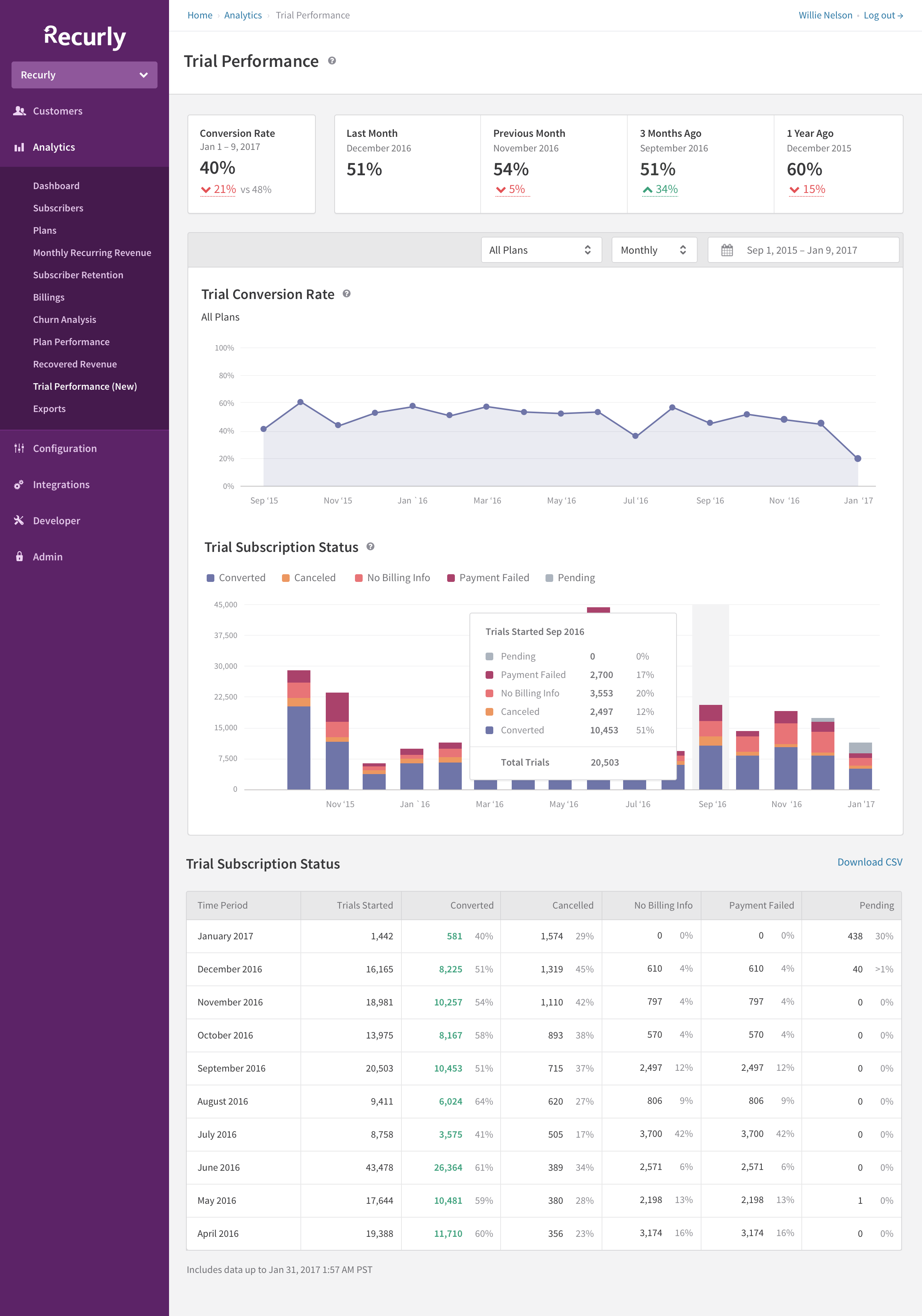
Trial Performance
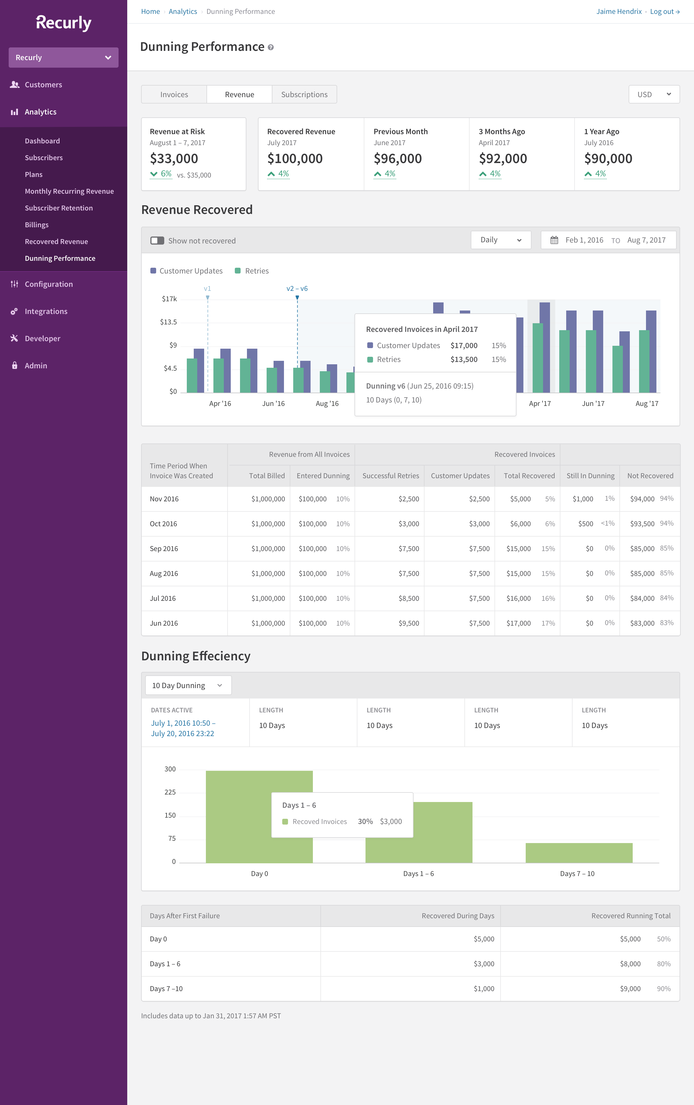
Dunning Effectiveness