Dunning Effectivness
What is Dunning?
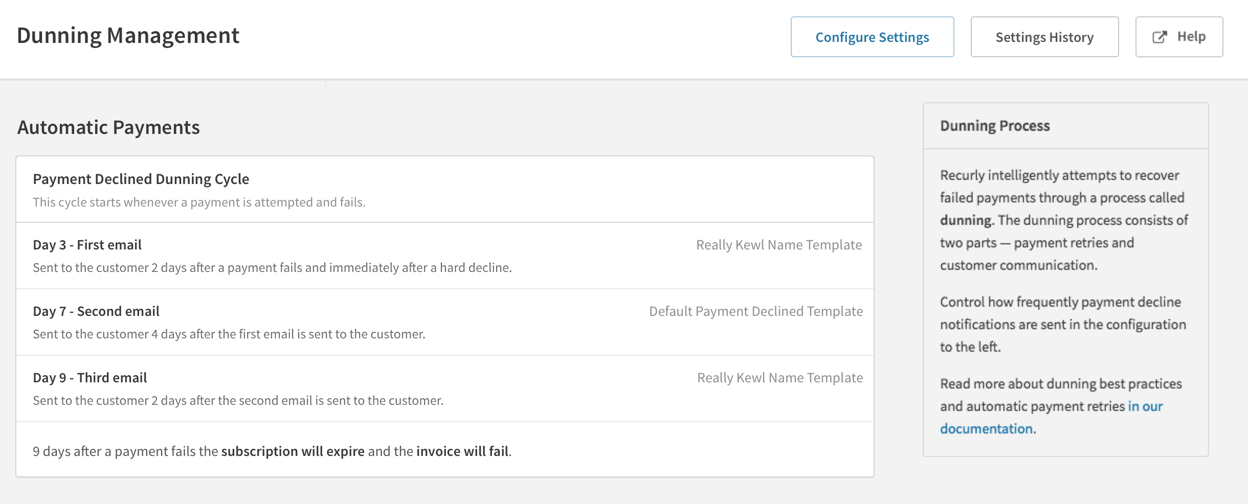
The term dunning dates back to the 17th century. To dun is to “demand payment for a debt.” In the context of subscription businesses it is the act of reaching out to customers to let them know that they are past due on their bill. Business who want to keep subscribers want a dunning management system they can optimize keep and recover customers they may have lost due to failed card payments, outdated billing information, or customers who just simply missed a payment.
What our customers wanted
One of Recurly’s main selling points is our dunning and retry process. For most of our merchants, our retry process saves customers more money than they pay Recurly. It’s not unheard for a Recurly merchant to recover 8X what they pay Recurly.
Prior to the Dunning Effectiveness report, customizing dunning settings was a black box where you change your settings and hope for the best, but there wasn’t an easy way to track the performance of the new settings.
Research
We spoke to merchants who had recently changed their dunning settings to try to understand what they changed and why—and if they were able to track whether or not they were seeing any positive differences.
We spoke to multiple customers who spent hours tweaking their dunning settings, waiting a few weeks, the exporting their data and trying to compare the results. They were making their best efforts to identify trends and ways to improve results. But the data was never quite at their fingertips.
Project Scope
Dunning Effectiveness was the second new report that the Analytics team tackled after launching the main Analytics redesign. Our goal with the new report was to help ensure that customers had a way to understand how their dunning settings affected their revenue and churn.
Early Concepts
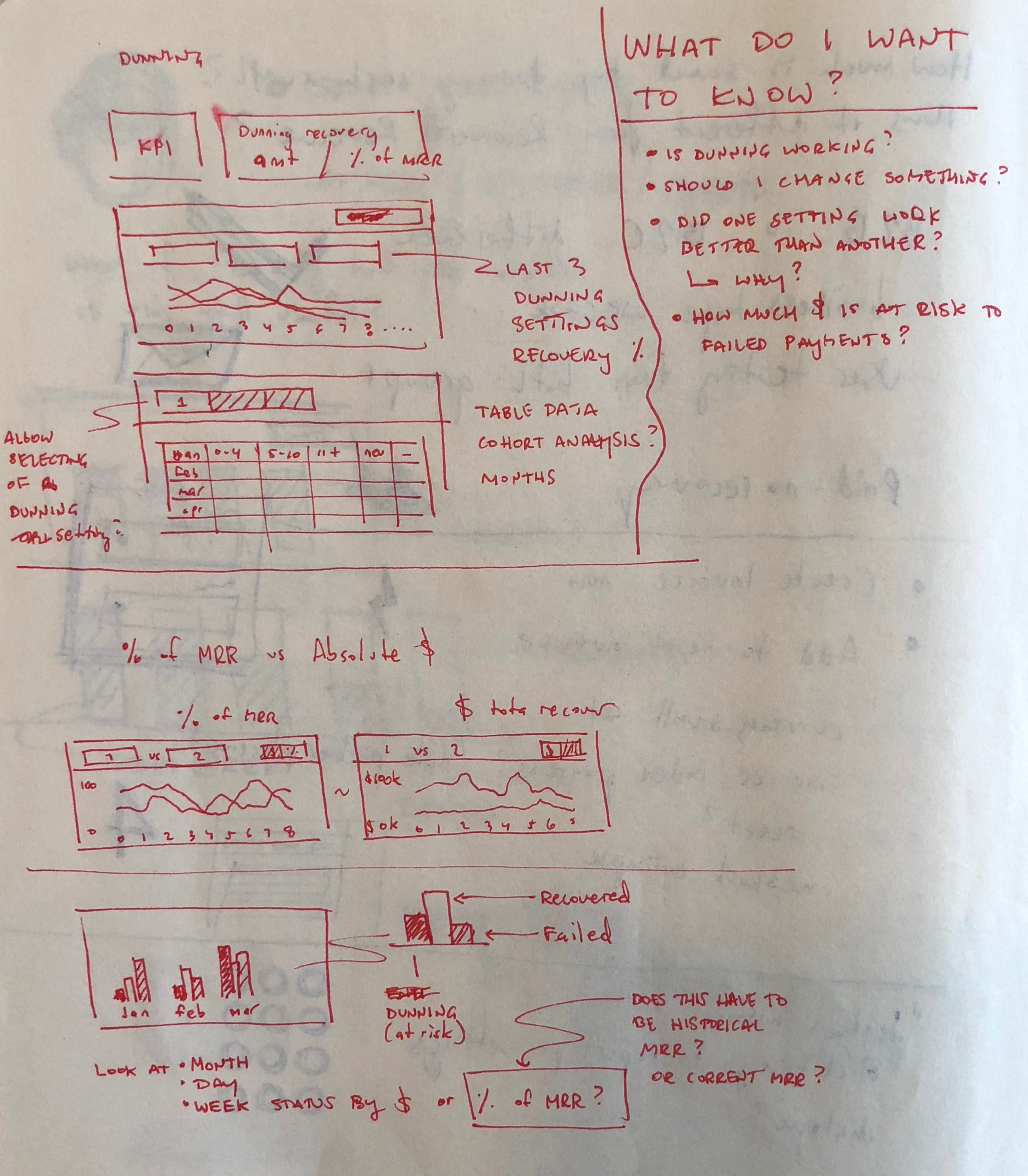
In the first stages of the project the team was still determining what data we wanted to surface for customers. What metric for recovery to we want to the report to focus on? Do we show the number and percentage of subscribers recovered? The number of invoices? Or should we focus purely on the amount of revenue recovered through dunning?
Working in super low fidelity wireframes helped to steer conversations both internally with the team, but also with the customers who were interested in helping us develop the report.
I initially explored a concept where two dunning versions could be selected for comparison.
The approach was ultimately scrapped as we determined that merchants with a reliable dunning configuration won't always be interested in a comparison.
Refinement
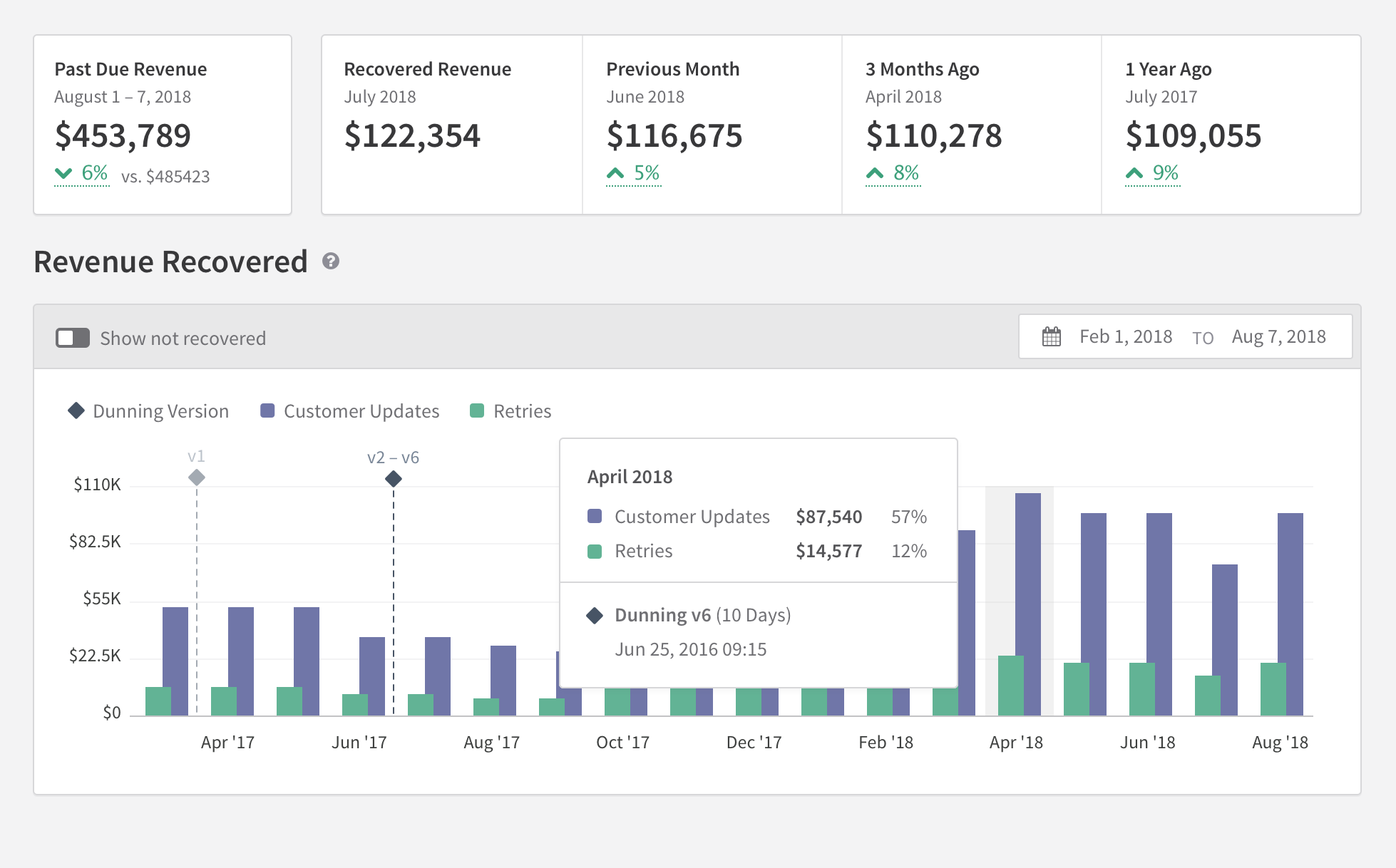
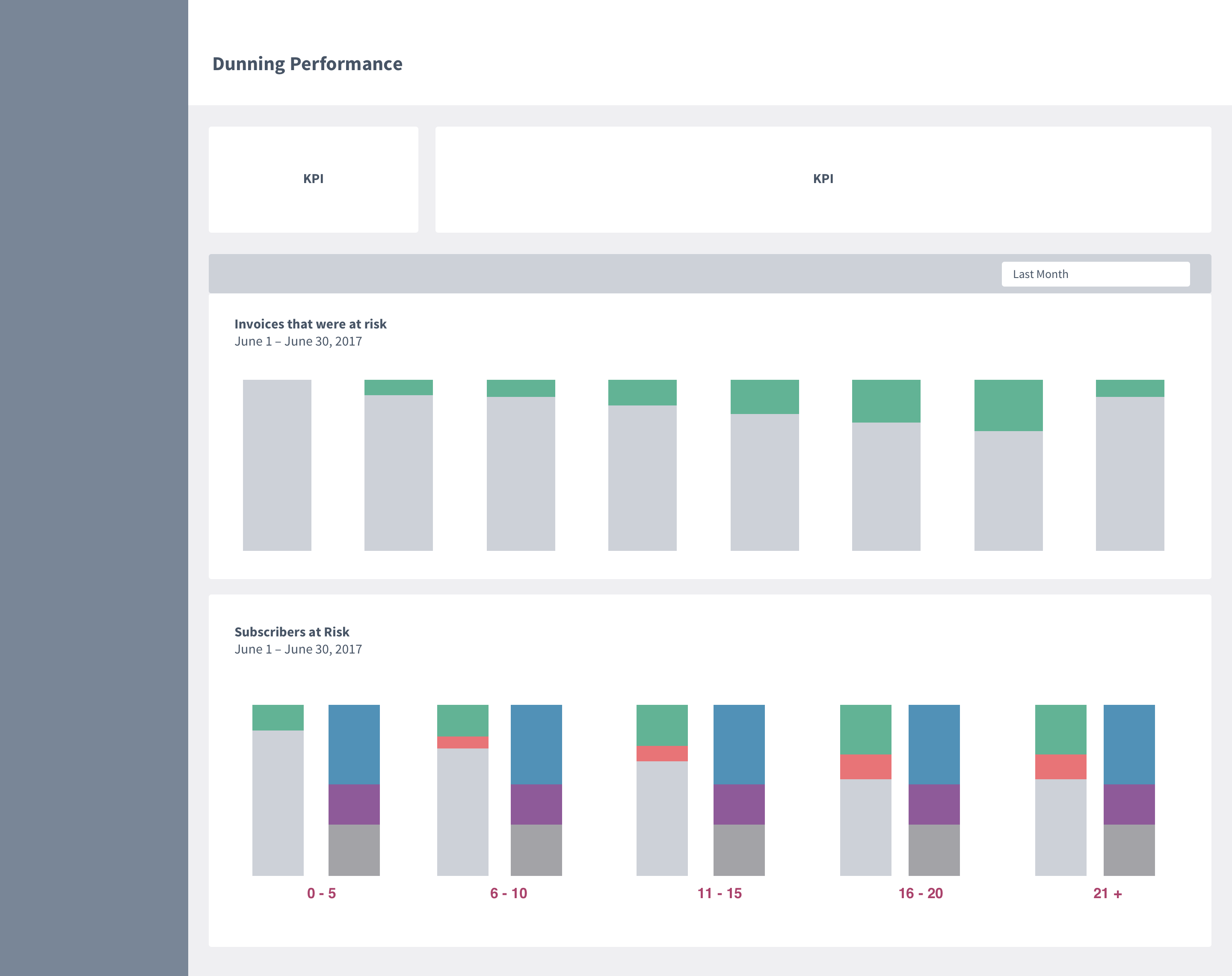
Eventually the team decided that all three metrics would be important to our users and work continued with a tabbed report approach. This would allow our customers to see exactly what data they determined was important to their business.
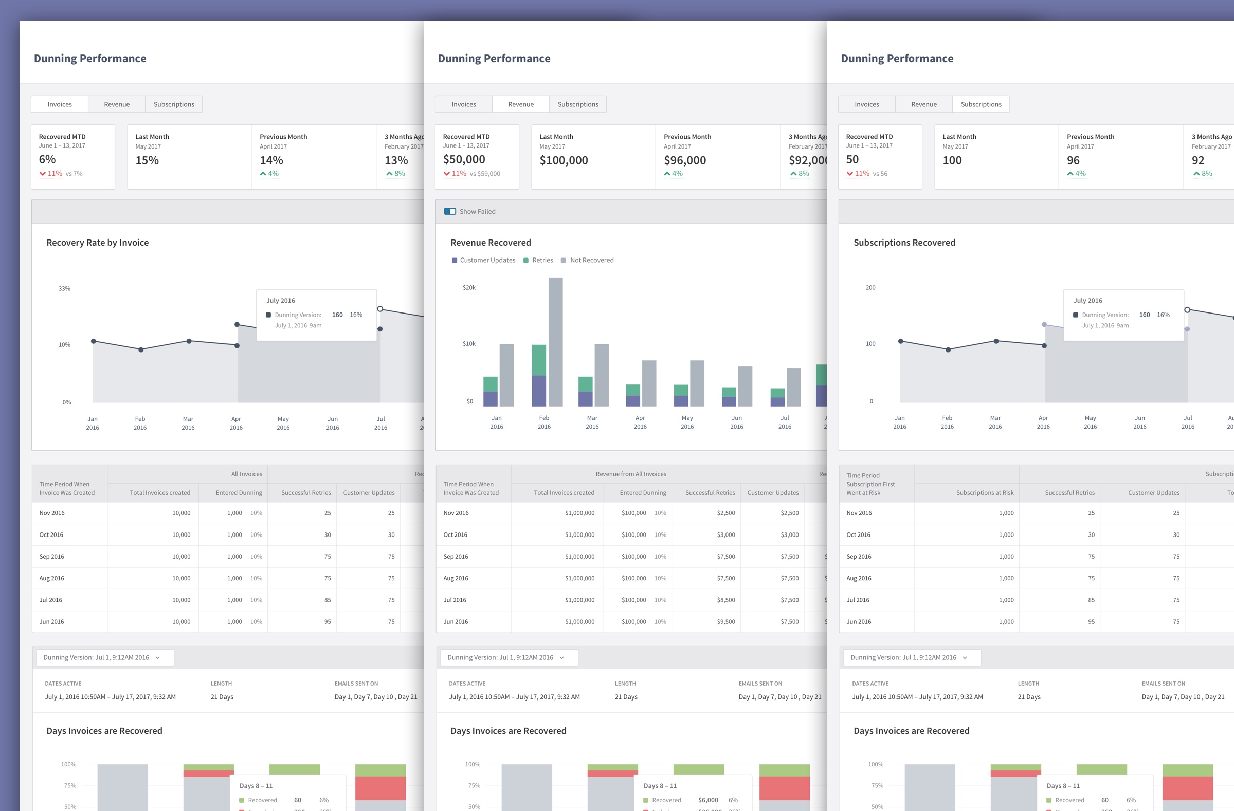
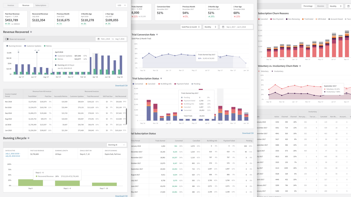
The report would now essentially be three-in-one. The report followed the same essential framework for all three tabs: Invoices, Revenue, and Subscriptions. From any of the three views merchants could see at a glance how well their dunning settings were performing.
Additional Components
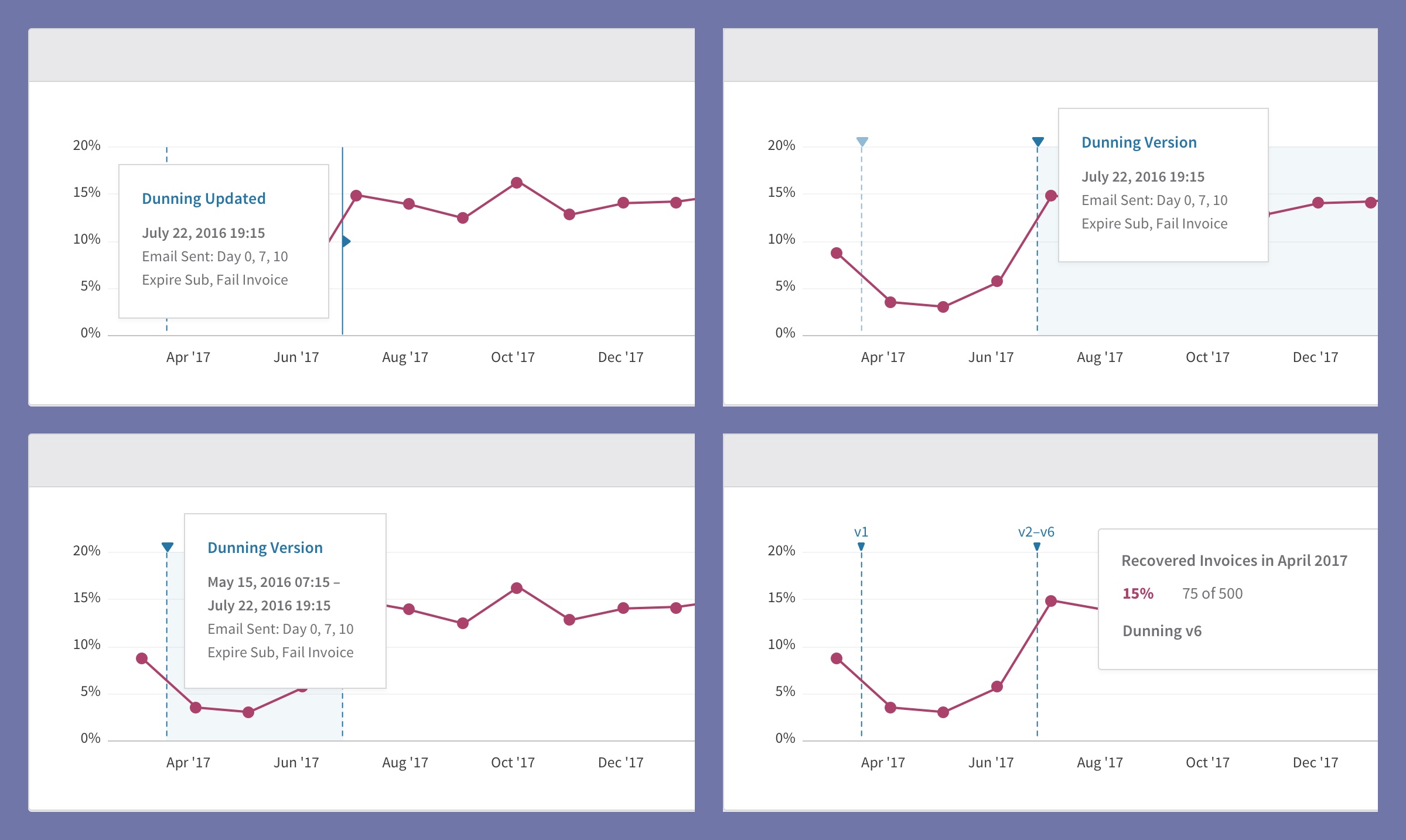
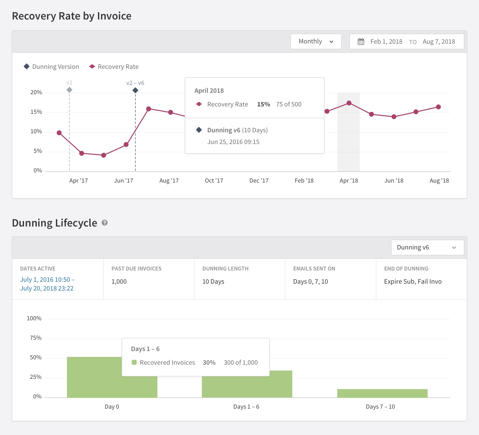
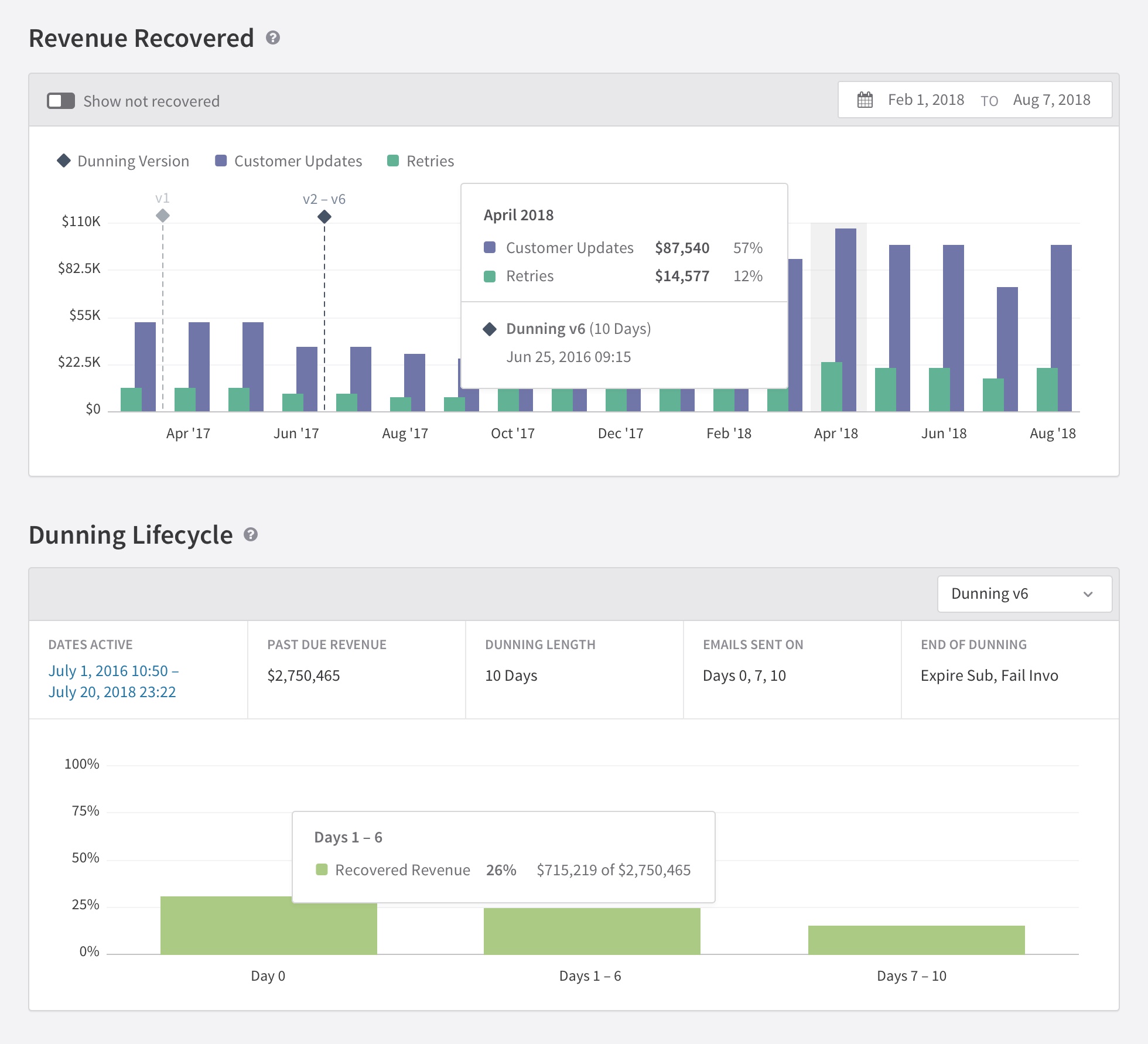
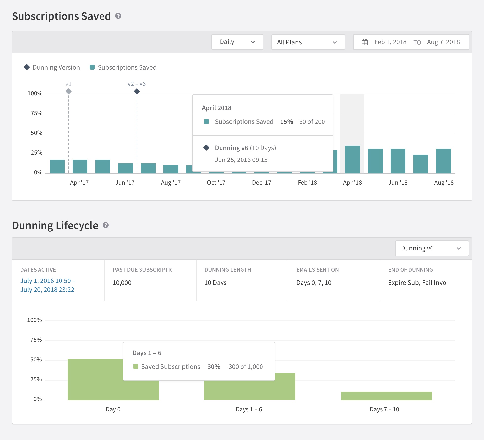
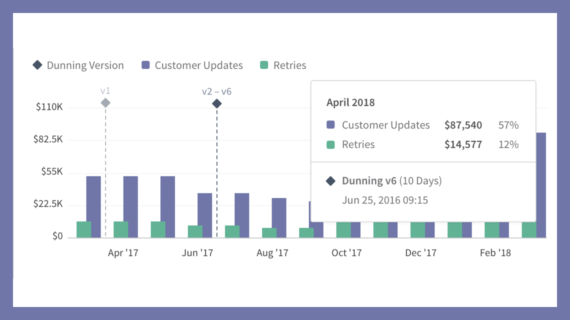
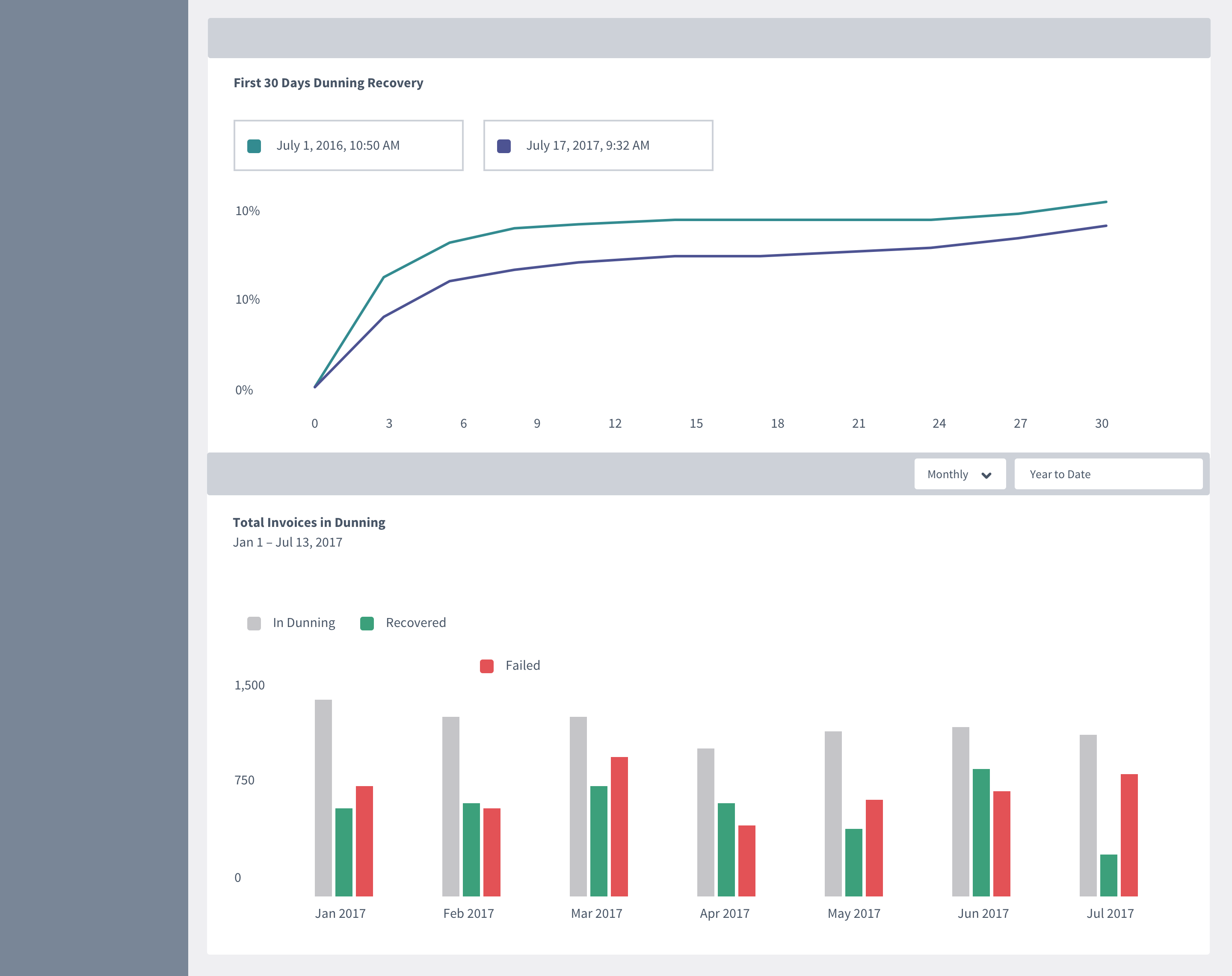
In order for users to know when the changes they made to their dunning report took place, we would need to have some kind of marker on the chart. This was a new concept introduced in this report that went through a few iteration before landing on the final design.
We determined the simplist way to analyize dunning settings was to assign a new numbered version each time they made a change to their dunning configuration.
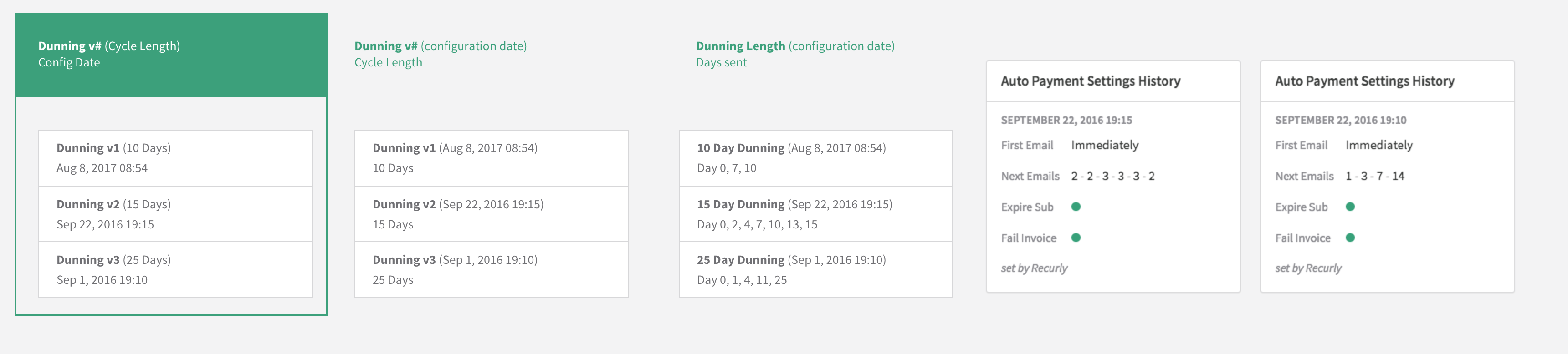
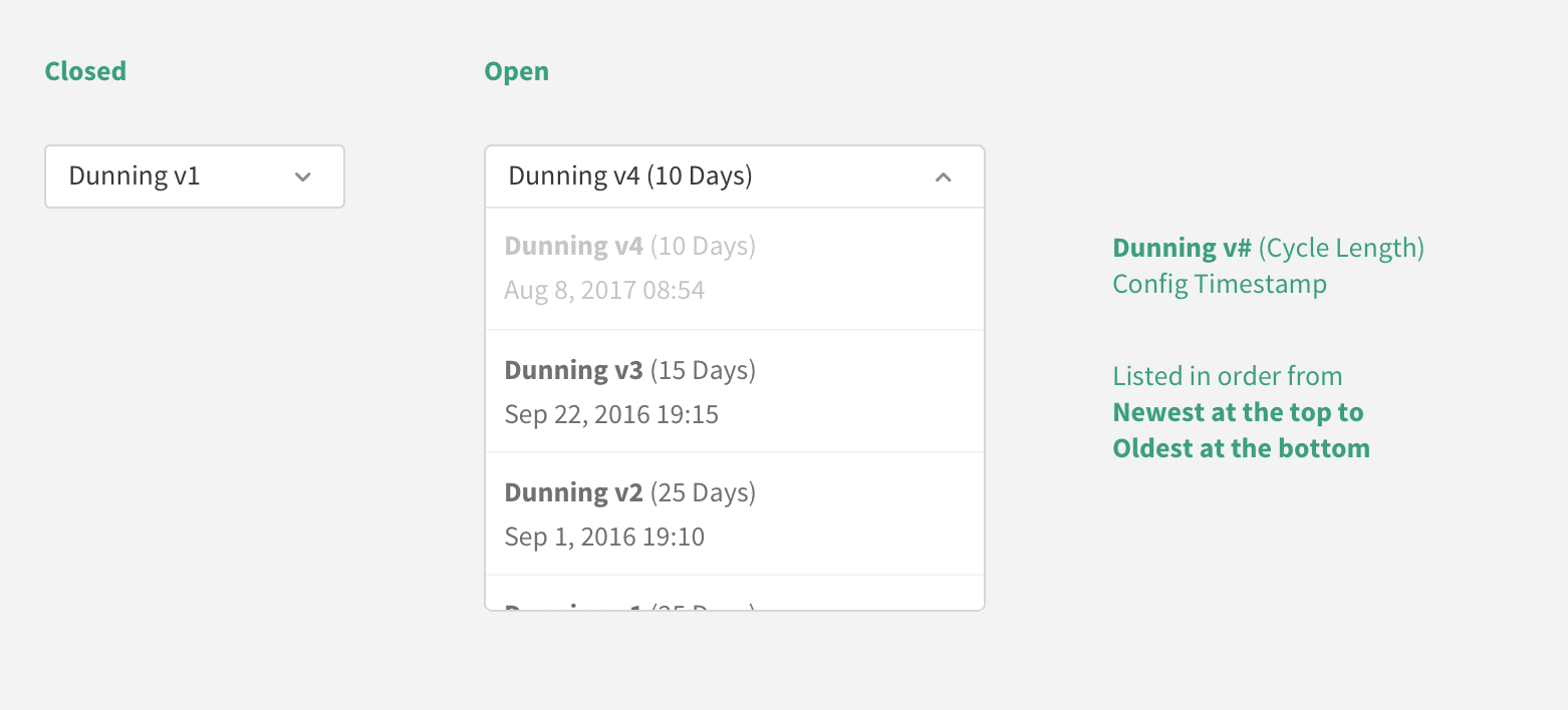
User also needed a means for selecting a specific Dunning Version to visualize the performance of that configuration.
High Fidelity Design
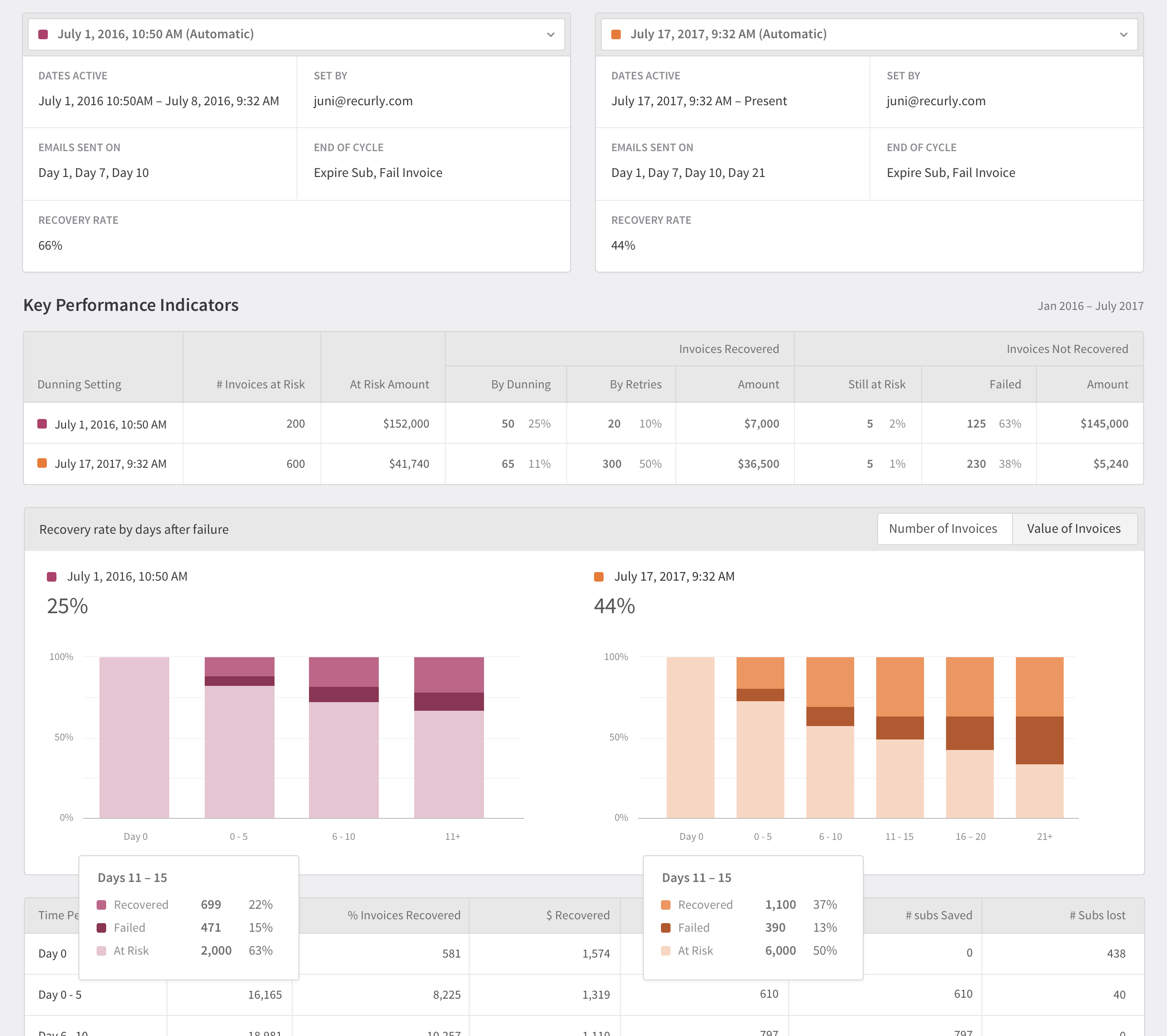
The top chart shows the overall recovery rate for each metric. The lower chart shows the recovery rate depending on when the dunning emails get sent to the customer. We also made it possible to switch to different dunning versions to visually see the difference that unique settings made.
Once we knew what data we wanted to show and the chart styles we wanted to us, it was time to move onto designing the final look and feel of each report.